The project brief was to transform an existing 6 storey office building of approx. 3050 sq.m. to provide new modern office space. The building was a typical example of 1980’s Dublin office architecture set on Lower Mount Street.
The building was stripped back to its original shell for a complete programme of deep refit upgrade works. All the building services, floorplates and shared amenity facilities were completely renewed. The thermal performance of the building was also improved giving the building another 20-30 year lifecycle.
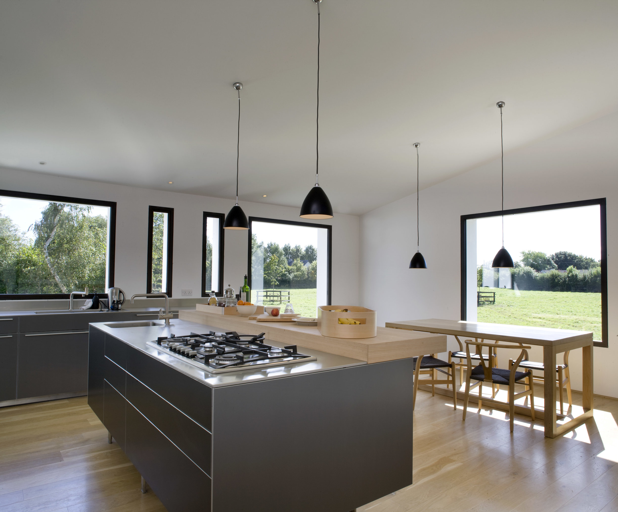
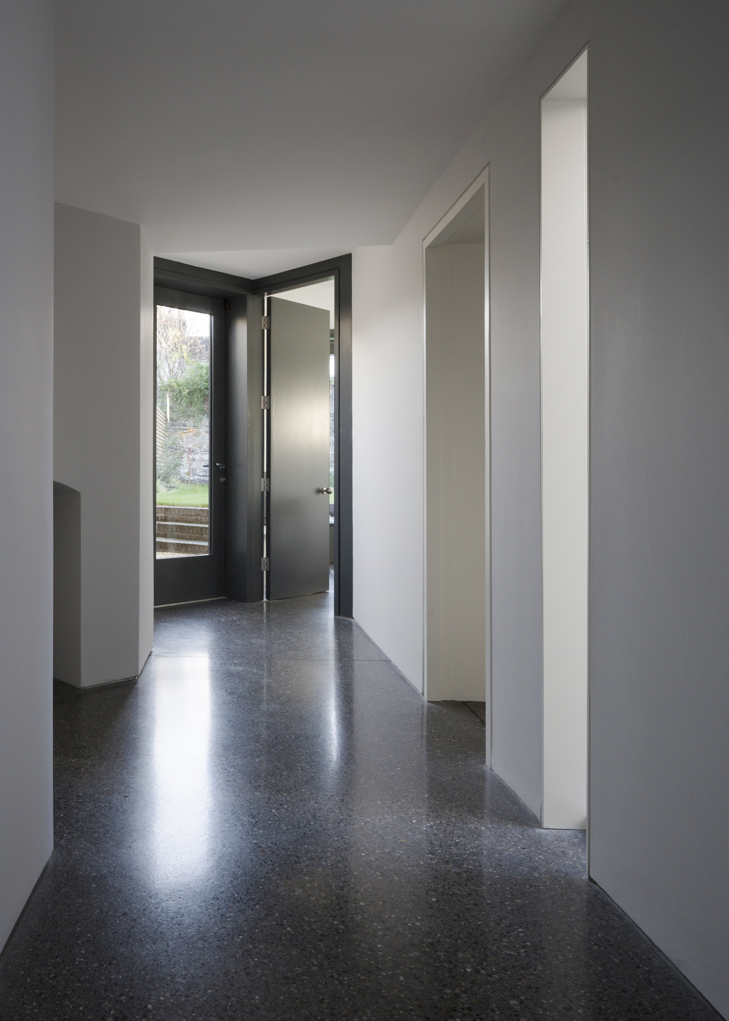
A slimline raised access floor was introduced throughout the open plan office spaces to provide maximum flexibility for tenant fitouts. The stair profile and lift thresholds were raised to provide seamless transitions throughout the building and avoid any internal ramps, the change in level was dealt with via a gently sloped reception space.
On the office floorplates a central bulkhead was introduced containing all the services. Elsewhere the existing concrete soffits are expressed in the open plan areas together with dropped pendant light fittings to maximise the floor to ceiling section. The cores were completely upgraded with new fittings and finishes throughout. Externally a new raised garden area and roof deck provide external tenant amenity spaces.
In line with the physical renewal of the building a further aspiration of the project was to transform the perception of the building on the streetscape. Though a wide urban boulevard with long vistas, the immediate surroundings on the lower part of Mount Street are rather undistinguished. The buildings are primarily experienced by vehicular traffic, viewed obliquely and at speed. The existing bay modules on the façade did provide some visual texture to the building and this has been accentuated by the installation of a series of new elements on the Mount Street façade. New window surrounds and a ground floor entrance canopy feature all in a matt black finish punctuate the red brick and provide depth to the façade announcing the building in the streetscape. At roof level a new canopy and linear light fitting provide a cap to the façade and terminate the roofline. The project is an exemplar of a refurbished reimagined building and shows what can be achieved working with the existing building stock and embodied energy rather than wholesale demolition and reconstruction.
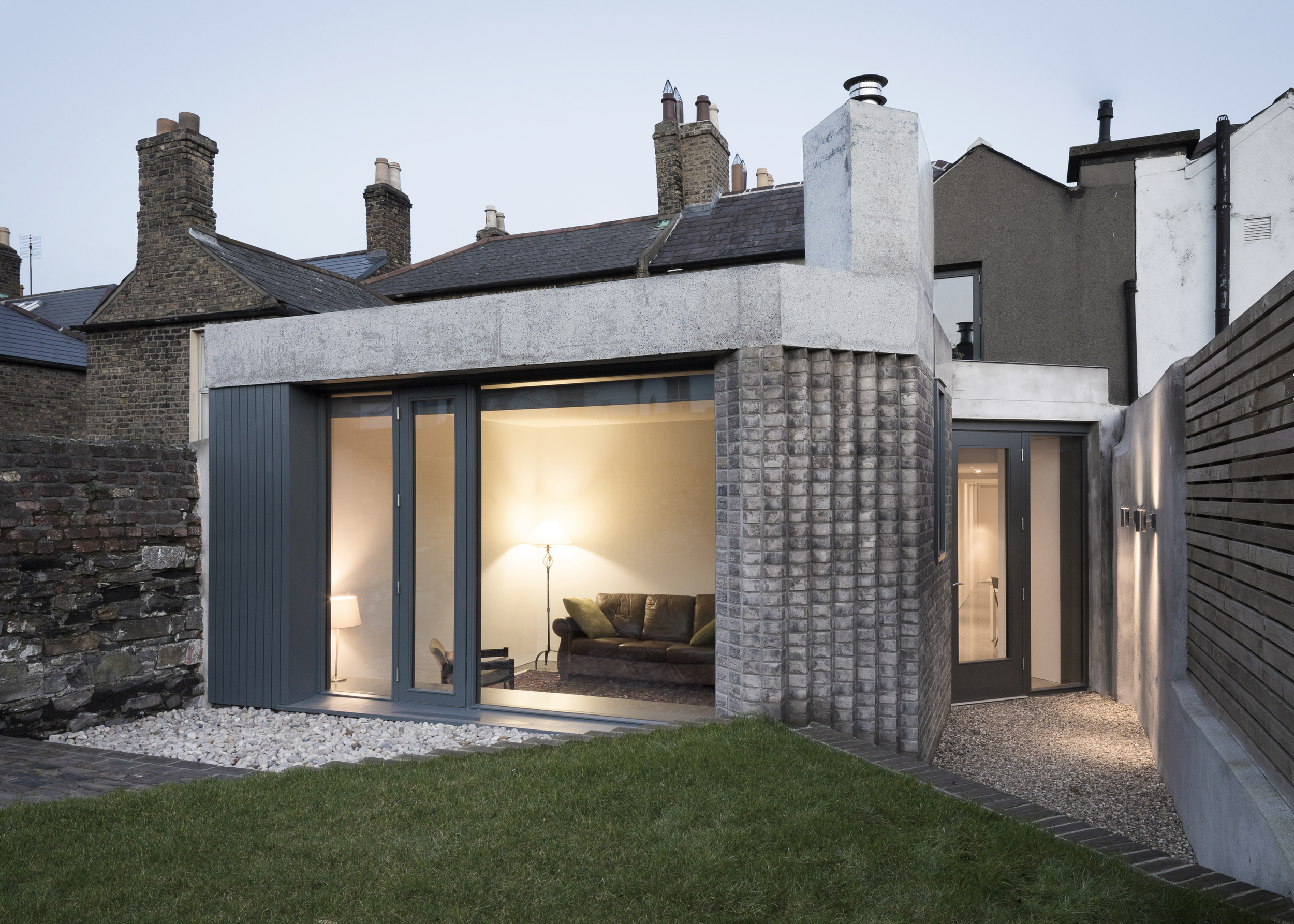
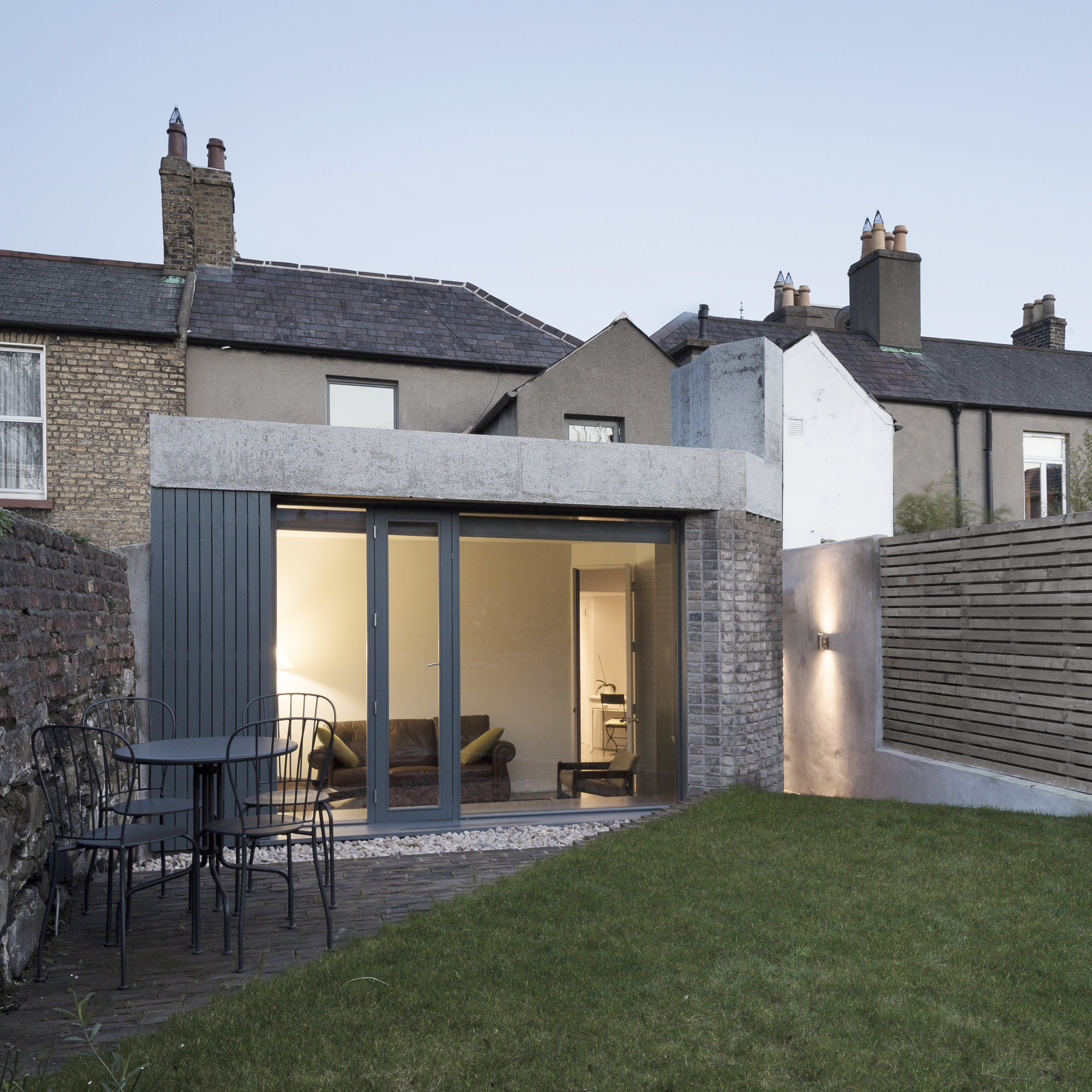
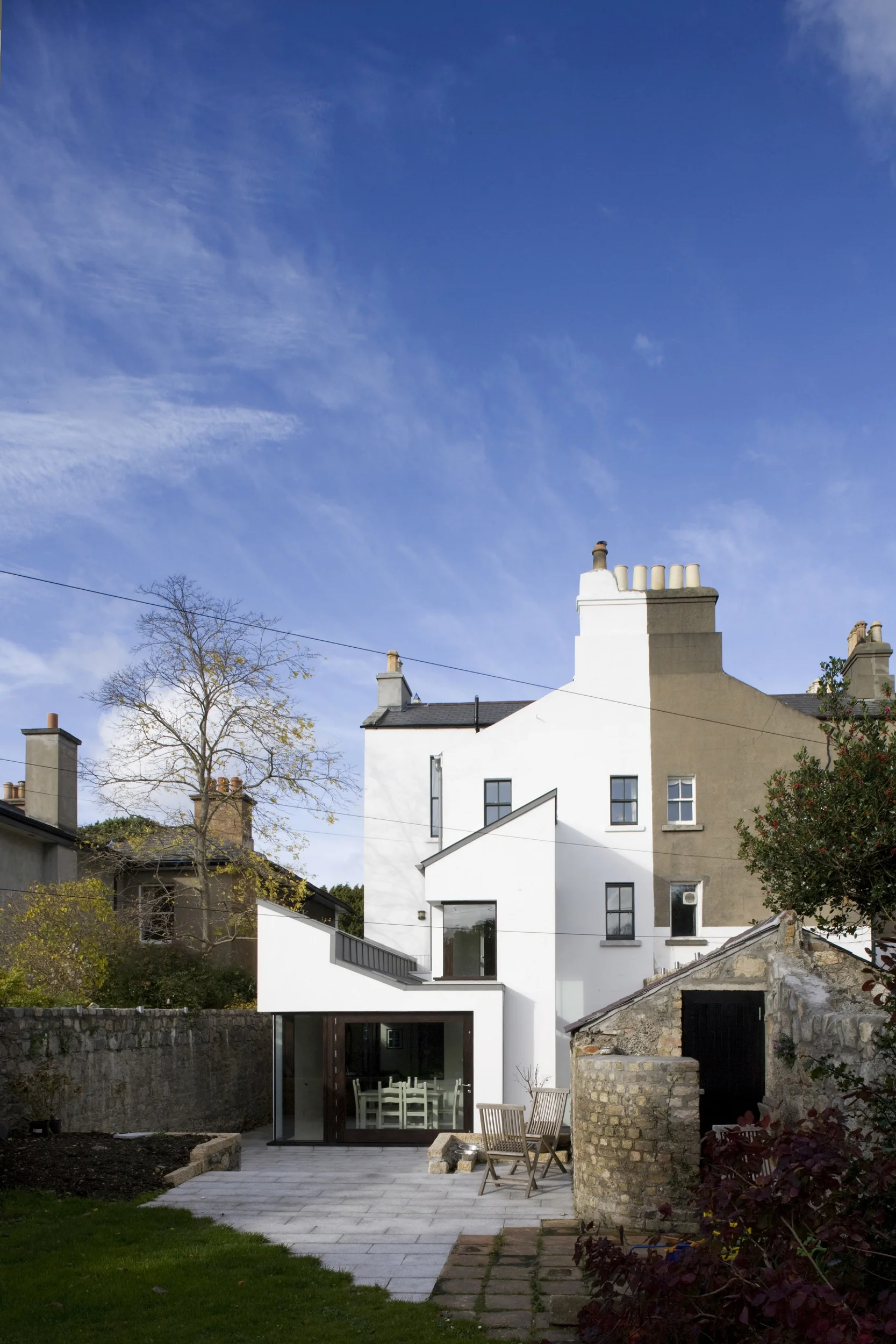
The existing building was the result of various extensions in piecemeal development to an historic blacksmithing forge in Schull, Co. Cork. The original forge was a road-fronted structure operating publicly to the Northern boundary of the site.
The extensions were consolidated under a large pitched roof, which restricted the available views of the surrounding landscape from the upper floor. On the lower floor, the low-lying form of the extension eastwards meant much of the rooms and circulation spaces remained dark.
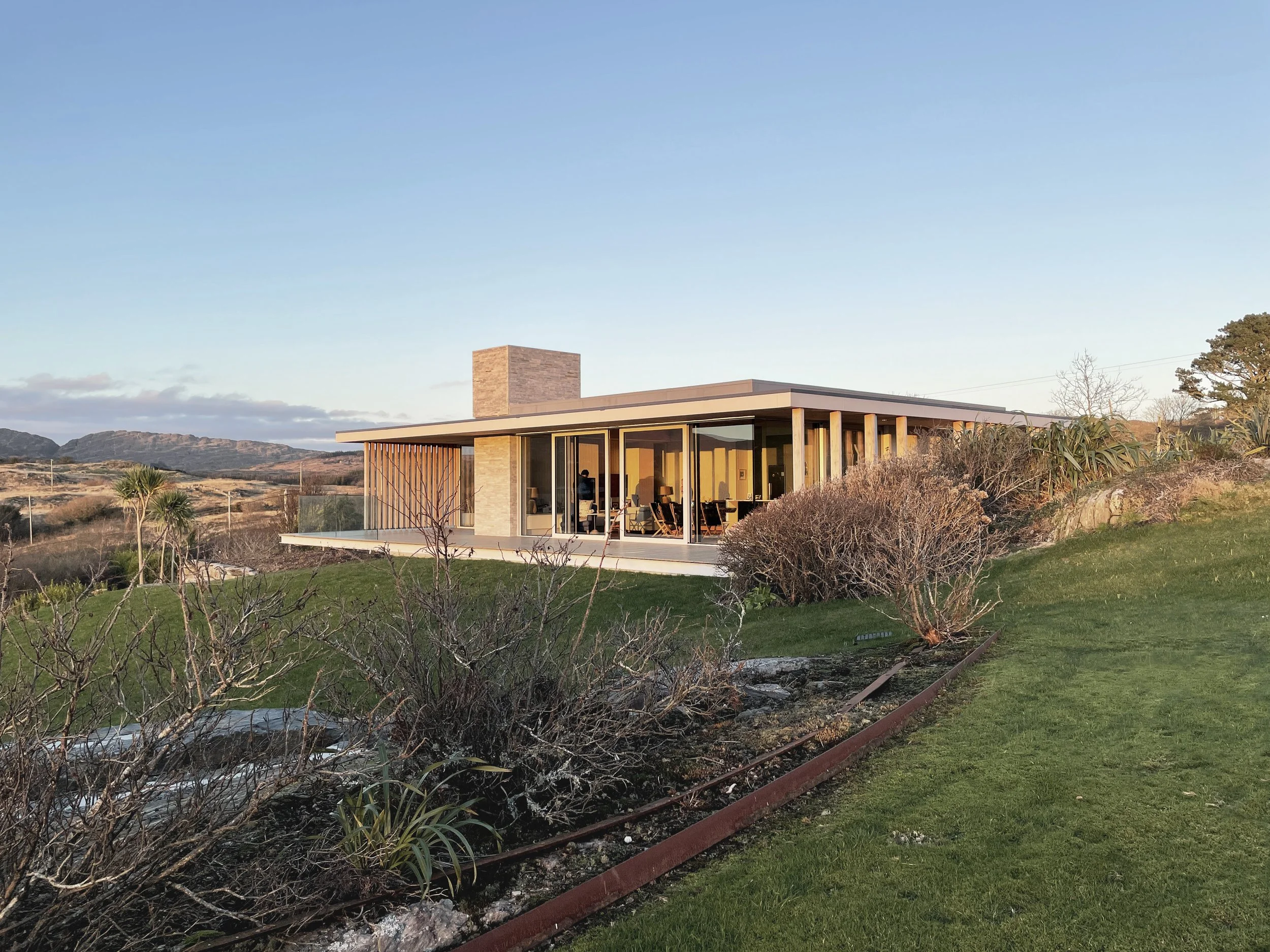
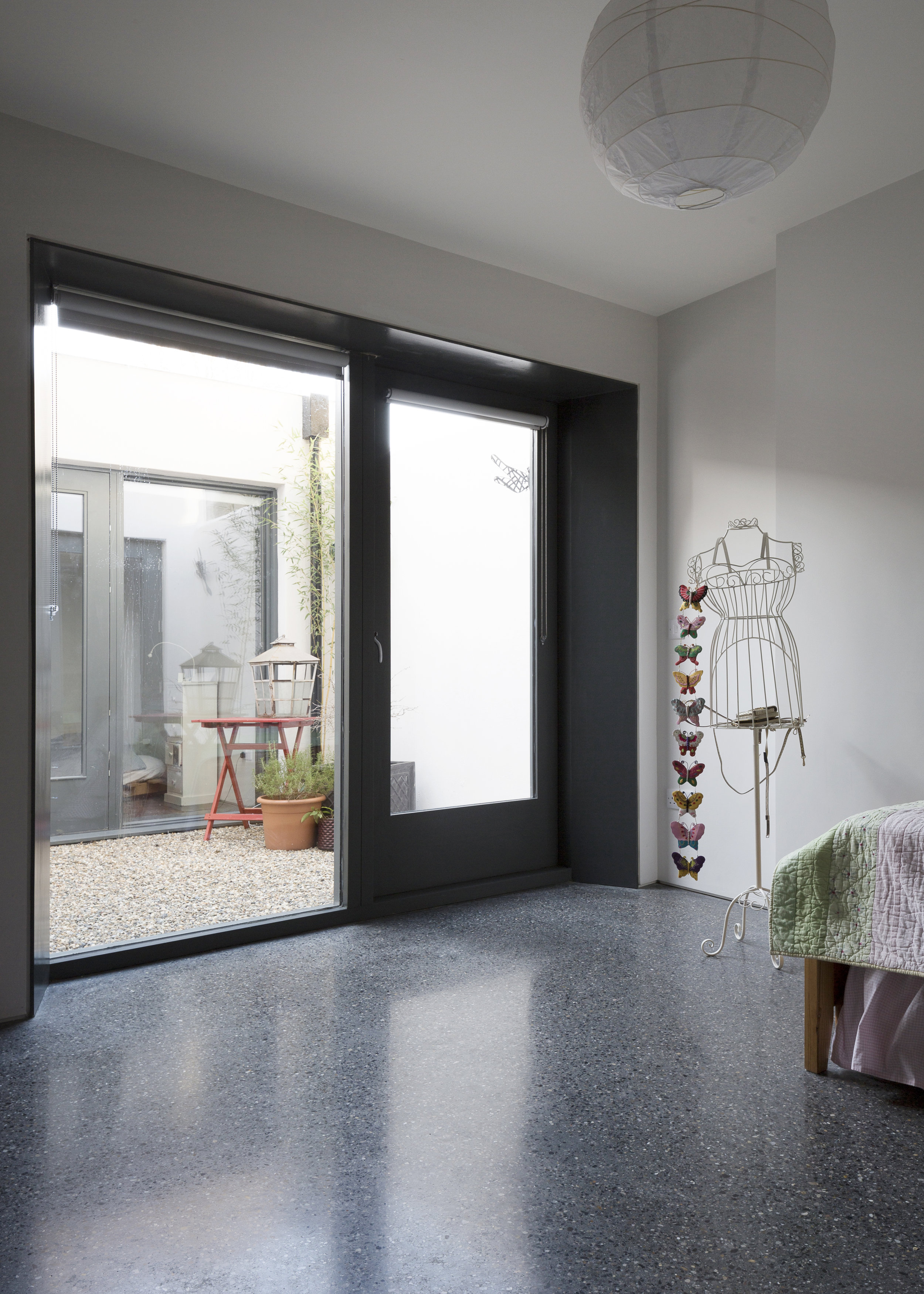
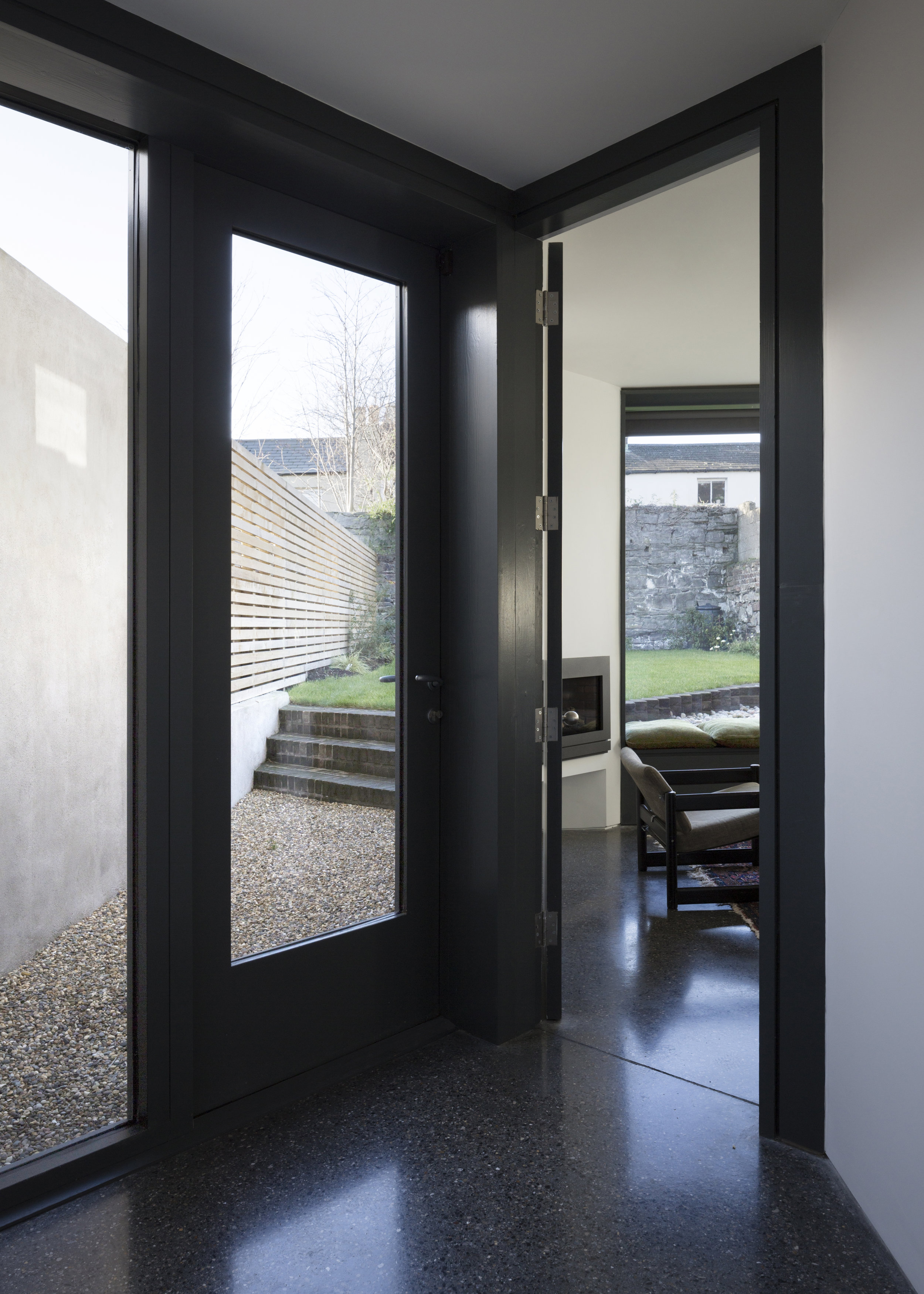
The owners wanted to strengthen the building’s connection to the existing landscape and better capture the surrounding scenic views. They engaged in sailing and sea swimming daily, and the design for the project oriented itself around those needs, with an interior reflecting their maritime interests.
The design sought to re-configure the existing house around the historic forge, responding to the site and existing structure through the use of perpendicular forms. The original forge chimney was used as an anchoring point from which these forms would extend.
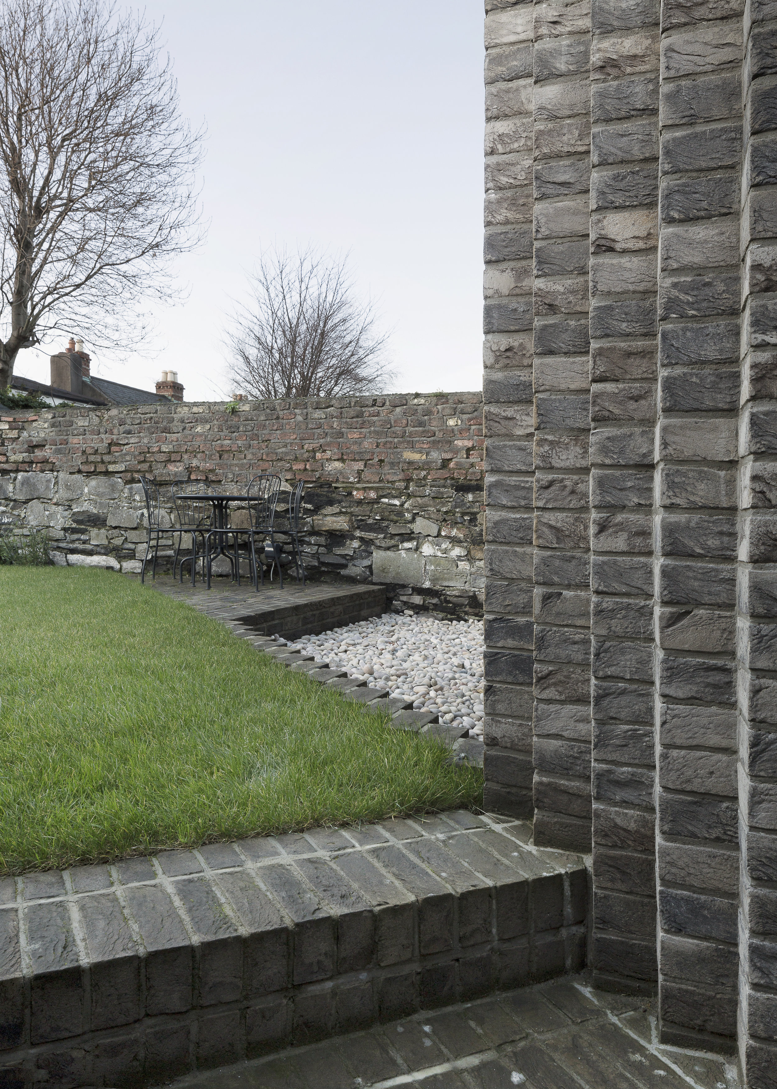
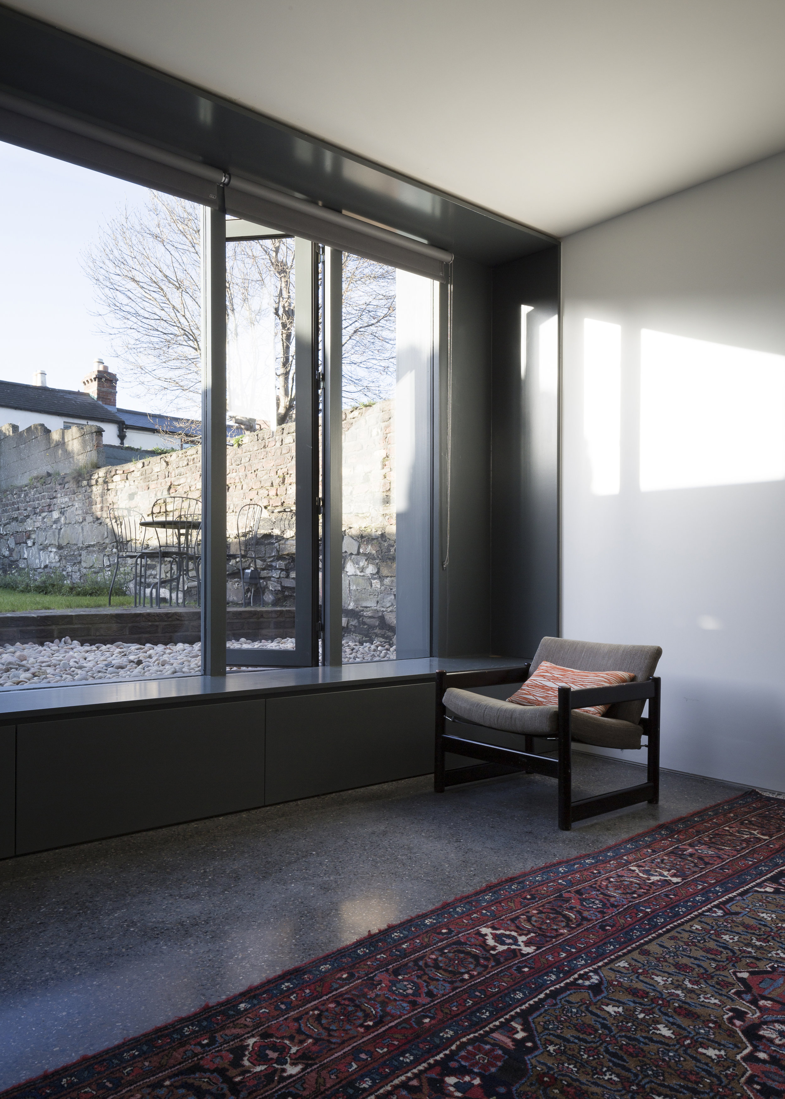
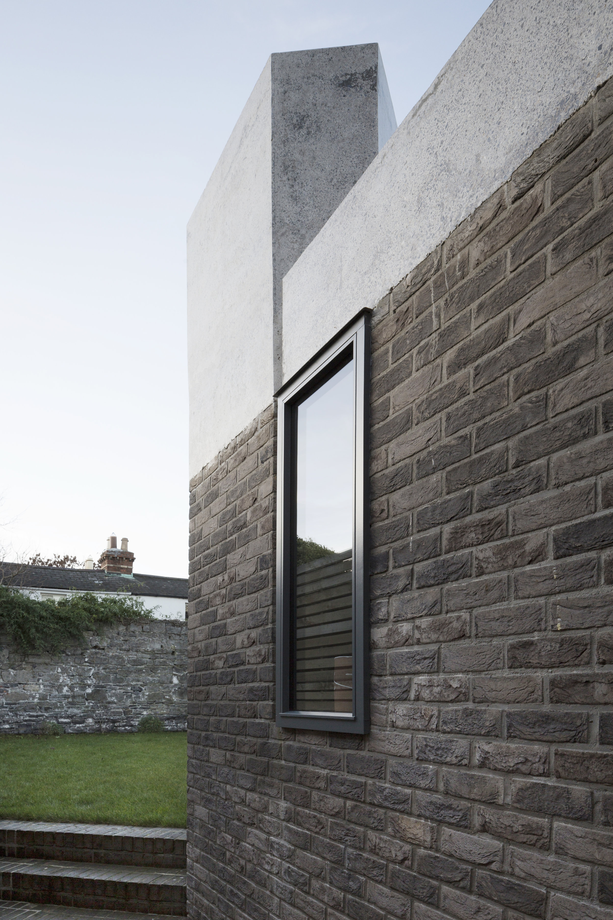
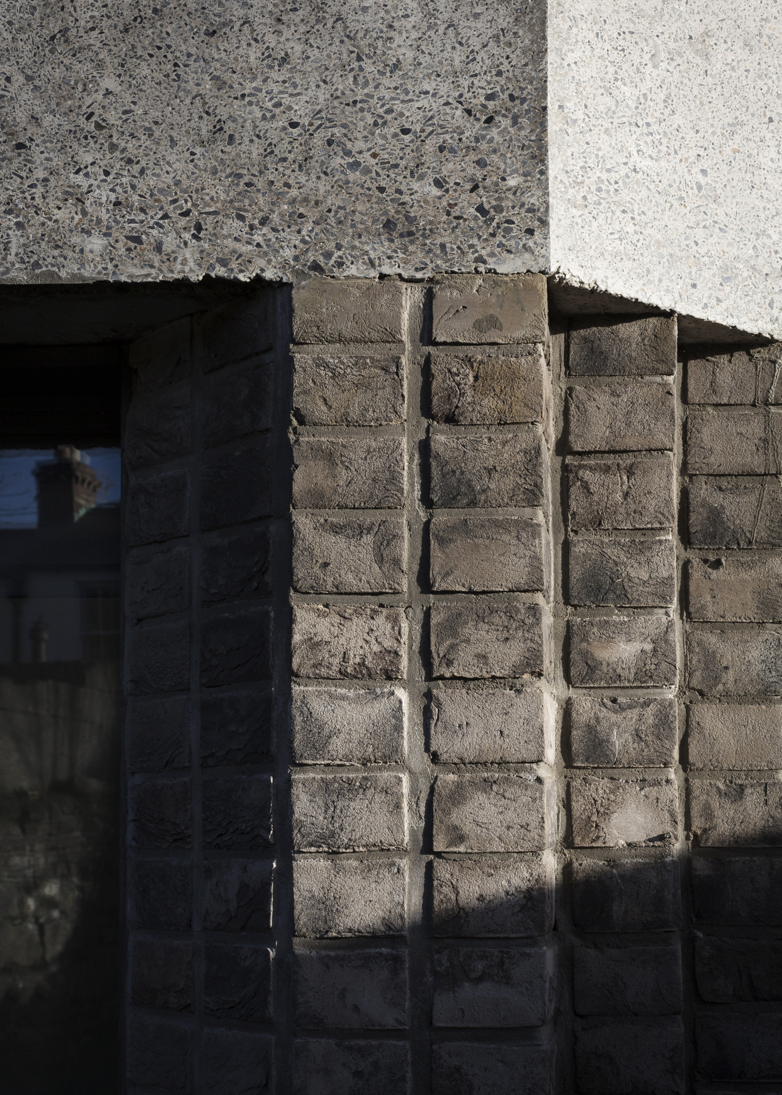
The lower form is constructed of stepped reveals clad in render to reflect the vertical erosion of the existing rock outcrop in this coastal location. The upper form is clad with slender timber elements and employs over-hanging roofs to emphasise a light element sitting on a contextual plinth. This in turn conjures nautical references of floating sails over a solid hull, reflecting the coastal setting of the project.
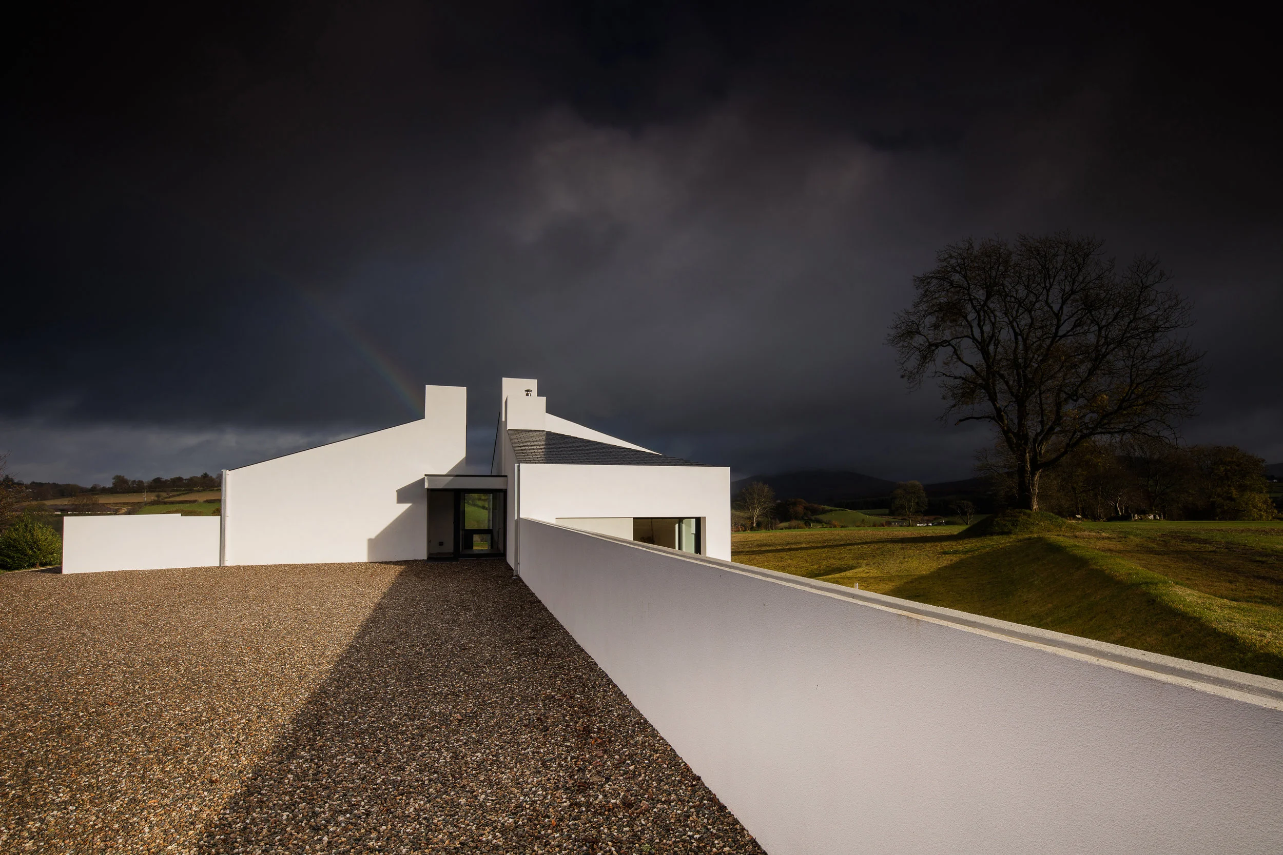
Sited within a rich cultural and natural environment this family dwelling in rural County Derry avails of strong context to infuence its design. Located on the boundary of Park village golf course the land is surrounded by panoramic views of the Sperrin mountains and adjacent a neolithic wedge tomb. Further along Tireighter Road a Clachan is located displaying elements of the traditional rural settlement once common in the area, clustered limewashed gables and walls similar to vernacular farmyard buildings.
The new dwelling form of three distinct but inter-connecting blocks conveys the three primary standing stones of the nearby burial chamber entrance. Similar to the Clachan each building bears a relationship with the other through proportional increase in scale whilst clustered buildings, rather than monolithic, step down the site via a central circulation. In this regard a local Palladian styled villa, Tamnagh Lodge, promoted reference to the Villa Rotunda in analysing how a centrally lit entrance hall and circulation might work, accessing bedroom, living and kitchen on upper, middle and lower floor plates repectively.
The three central “stacks’ indicate entrance; one captures light over the external entrance porch, another provides lightwell to the central hall and the third is flue extract for the living room stove. Two stairwells within the connecting spaces between the blocks allow for vistas from the entrance hall to the Sperrins and the boundary mature tree.
Materiality references dense massing of the wedge tomb, thick white gable walls of the Clachan and tall chimneys of Tamnagh Lodge. Building orientation, similar to the wedge shaped tomb, provides a blank North façade with extending walls for privacy to where the house opens up to the South and West. Elevations remain simple, alluding to classical post and beam or column and frieze as displayed in the nearby burial chamber structure.
The original Adelaide Hospital Building underwent a refurbishment in the early 2000’s to create the current multi tenant office complex known as Adelaide Chambers. The original works were poorly executed and there had also been an under-investment in the building upkeep in recent years. The building had inherent qualities but these were obscured by the garish colours and materials that had been used in the original refurbishment. The goal was to exploit the qualities of the original protected structure, upgrade the building amenities and give the tenants a workplace to be proud of.
The aspiration was to return to the understated elegance befitting the building as well as providing the ancillary facilities expected by tenants in a high quality office building. The drama of the magnificent cantilevered stone staircase wasn’t celebrated upon arrival with the reception desk shoehorned into an ancillary side room. The new reception desk was relocated to the main hall and visually leads ones eye to the staircase upon arrival into the building and the stepped profile of the desk gives the space an Escher like quality. A more appropriate and understated colour palette, finishes and lighting scheme combined to transform the main space in the building back to its former glory. The chosen material palette was continued up throughout the stairwell and common areas achieving a consistency throughout.
Brass detailing and graphite colours are continued into the lower ground floor area to achieve a consistent aesthetic to the works. At lower ground floor level unused meeting room spaces were reconfigured to create new office suites. The WC areas were completely refurbished including the creation of new wetroom shower areas. A disabled access WC was created where there was none before and a kitchenette complete the new tenant facilities.
The building was occupied throughout the contract works and includes an embassy tenant that has members of the public visiting on a daily basis. The building had suffered from under-investment in recent years and the refurbishment works have not only provided a space for the tenants to be proud of but also assisted the client in consolidating the tenant profile and increasing the value of their investment.
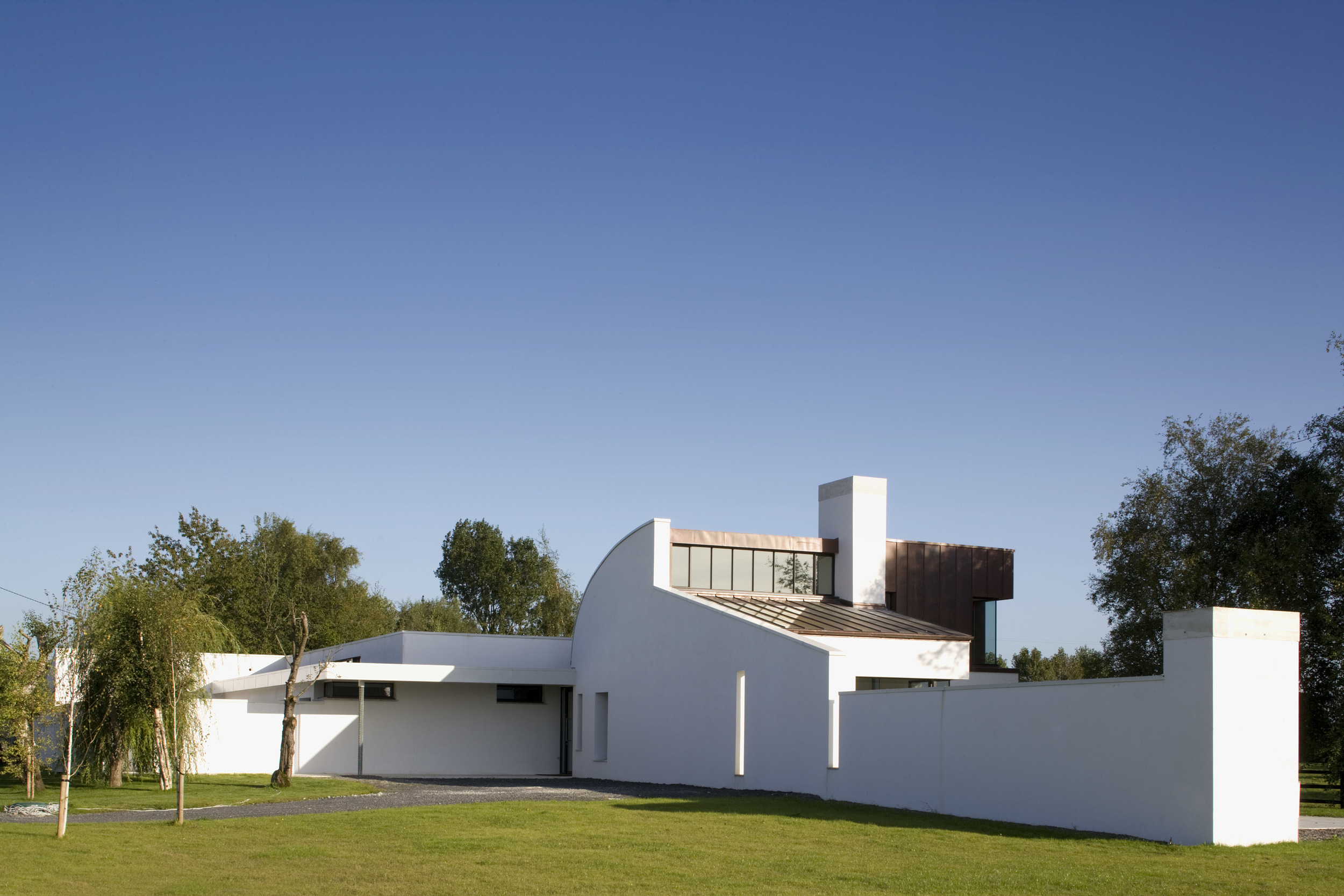
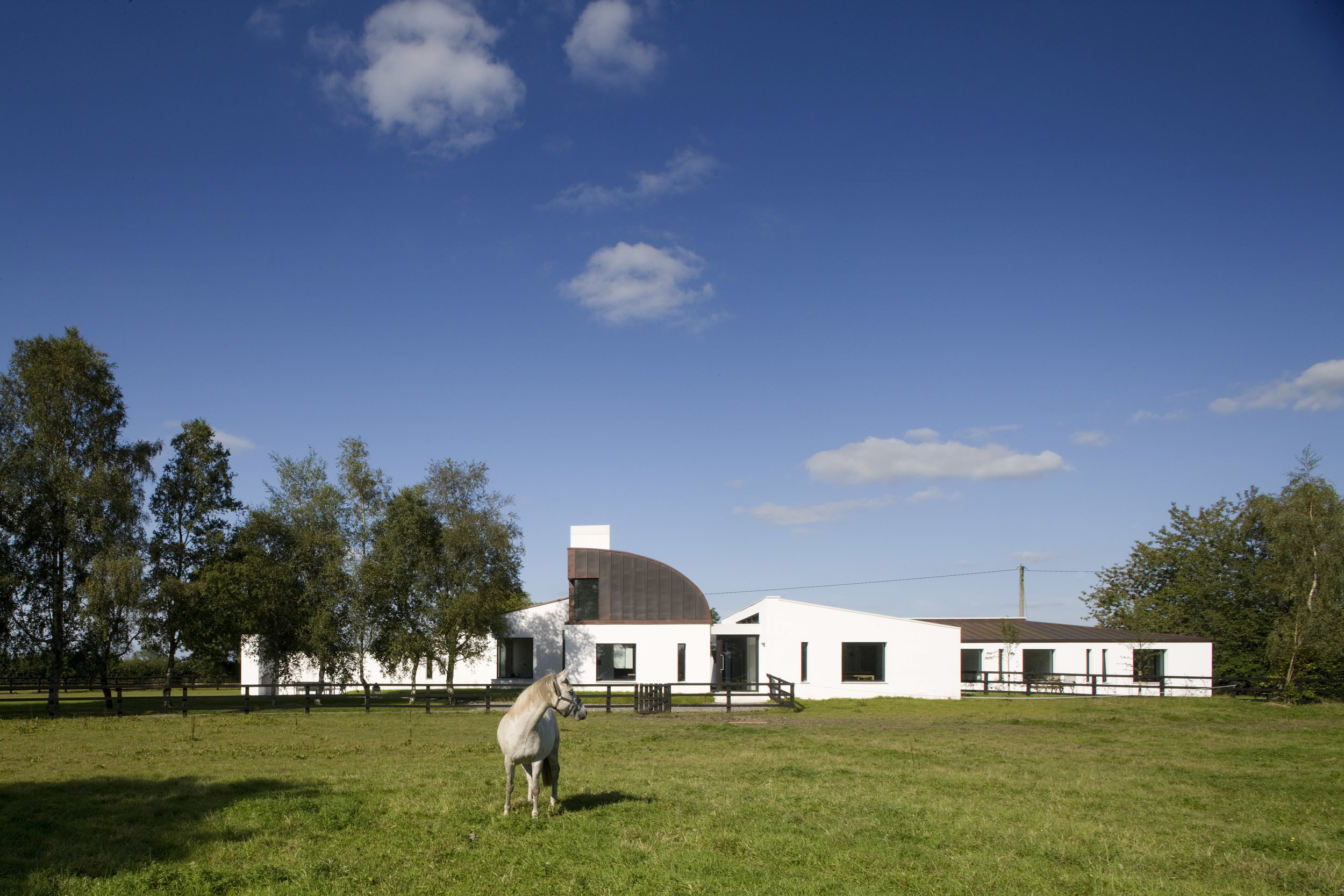
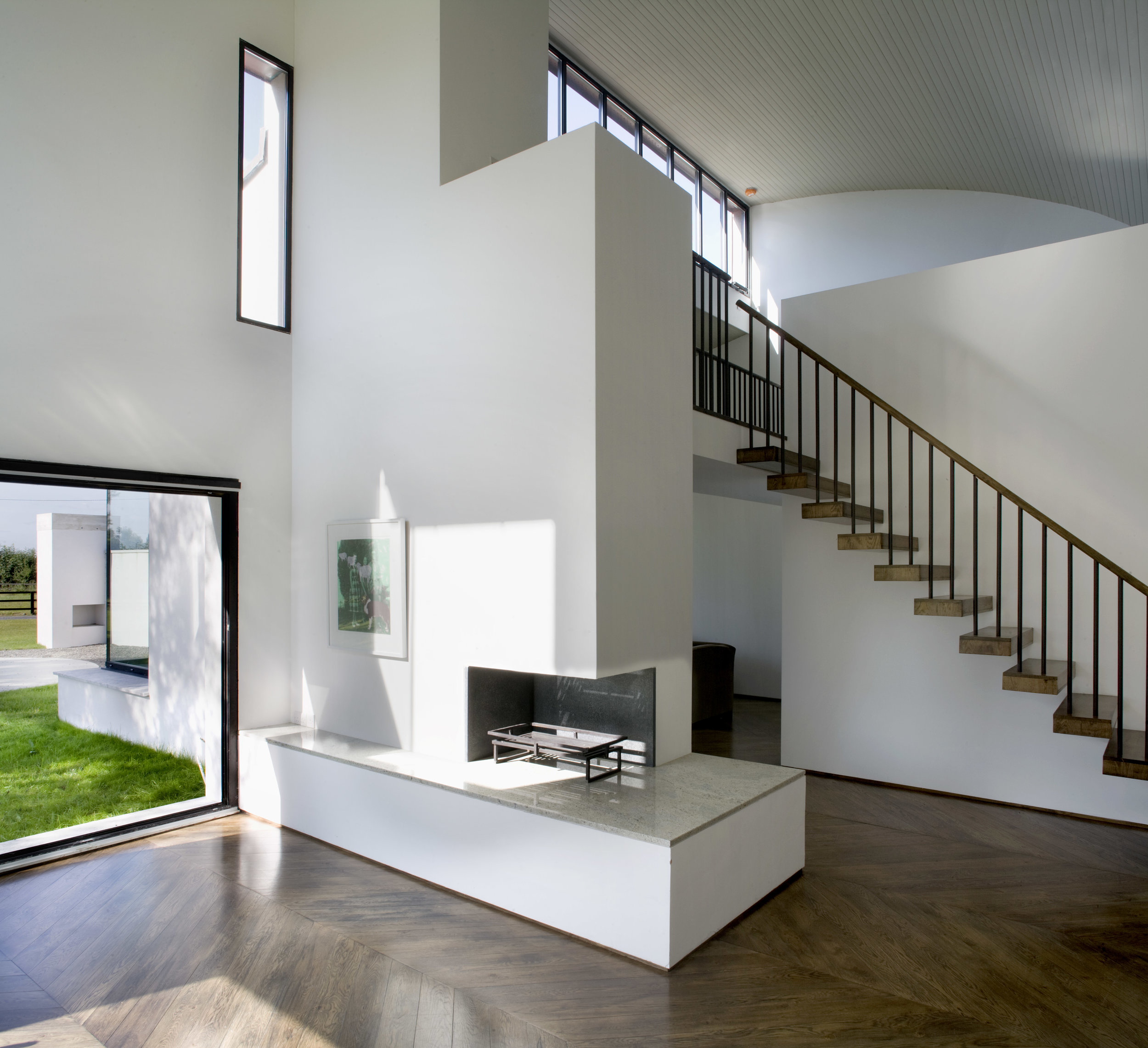
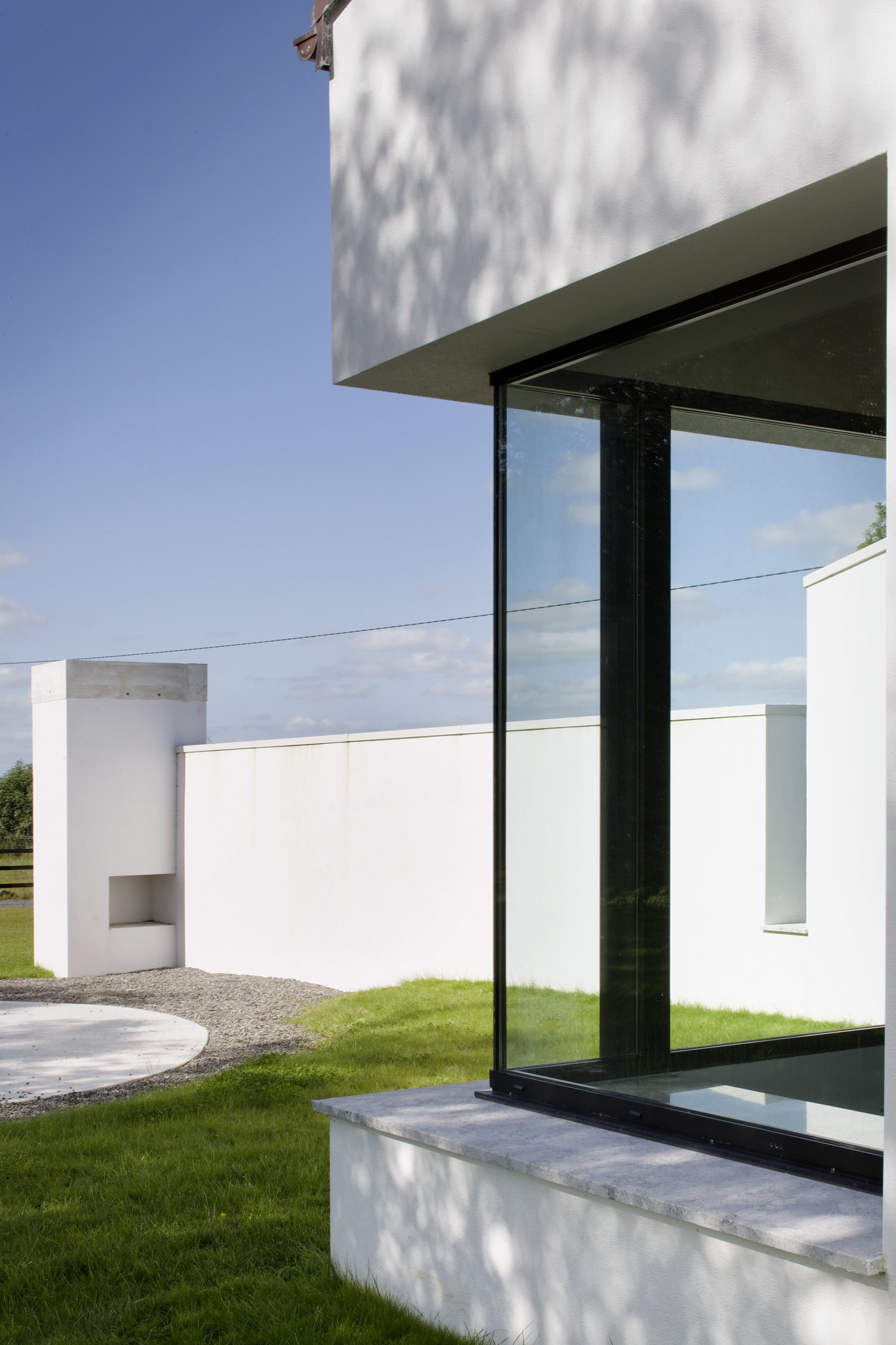
The new house sits centrally in the site, commanding access to the stables whilst dividing the landscape into three areas; paddock, field and stables. In response to this the house’s gardens are divided into walled, fenced and open types. The idea of these divisions was inspired by the working, private and public courtyards of traditional Irish farmyards - a concept which further defined the planning of the house internally.
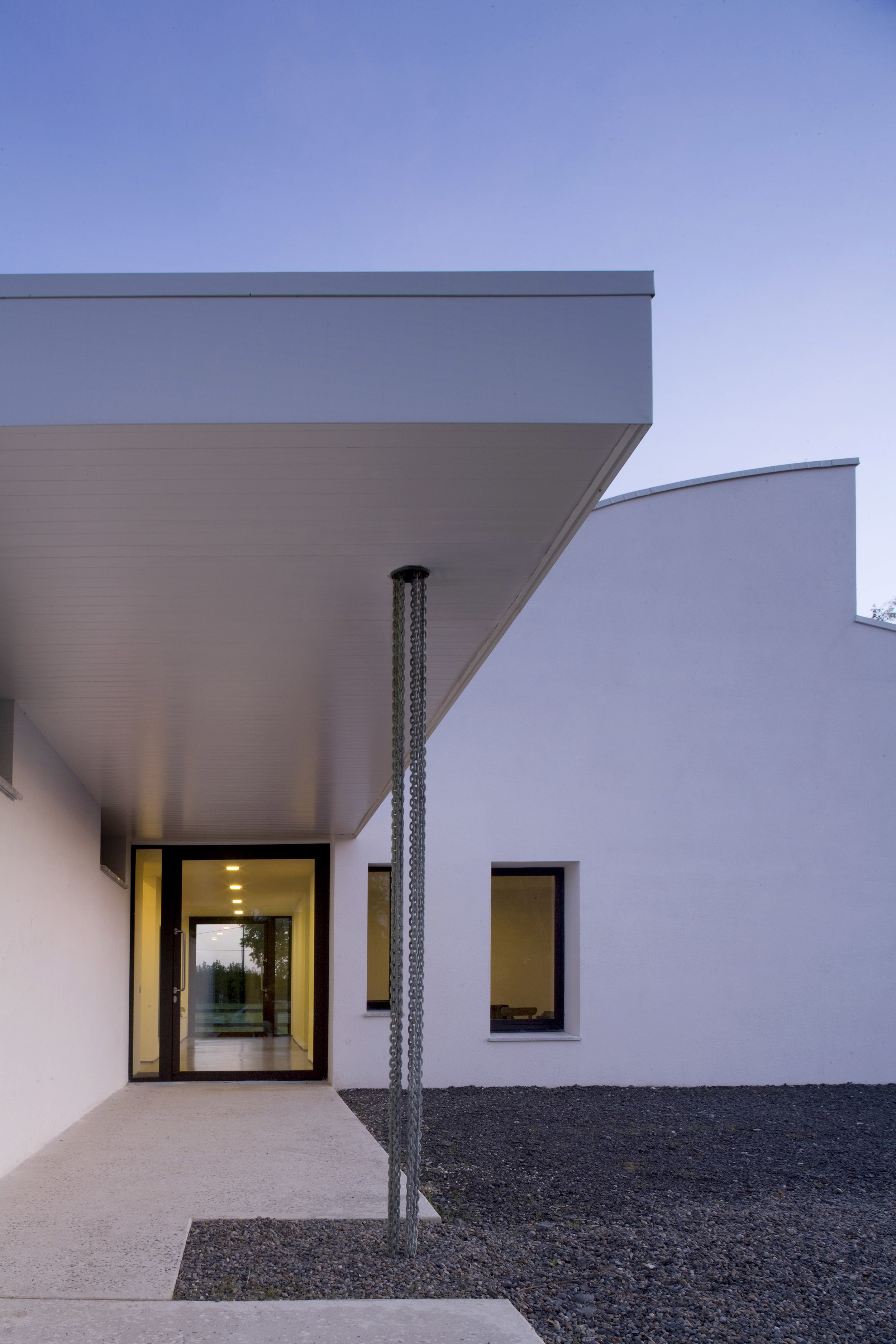
A new driveway within the site was designed to cater for a North facing entrance in order that circulation through the building is directed towards direct sunlight and subsequently allowing external opening up of the building from the East, South & West facing facades which gain privacy from enclosure walls extending from the gables. The curved route of the new driveway provides space for terraces and garden whilst affording glimpses of the building, before a panoramic view on turning into the entrance.
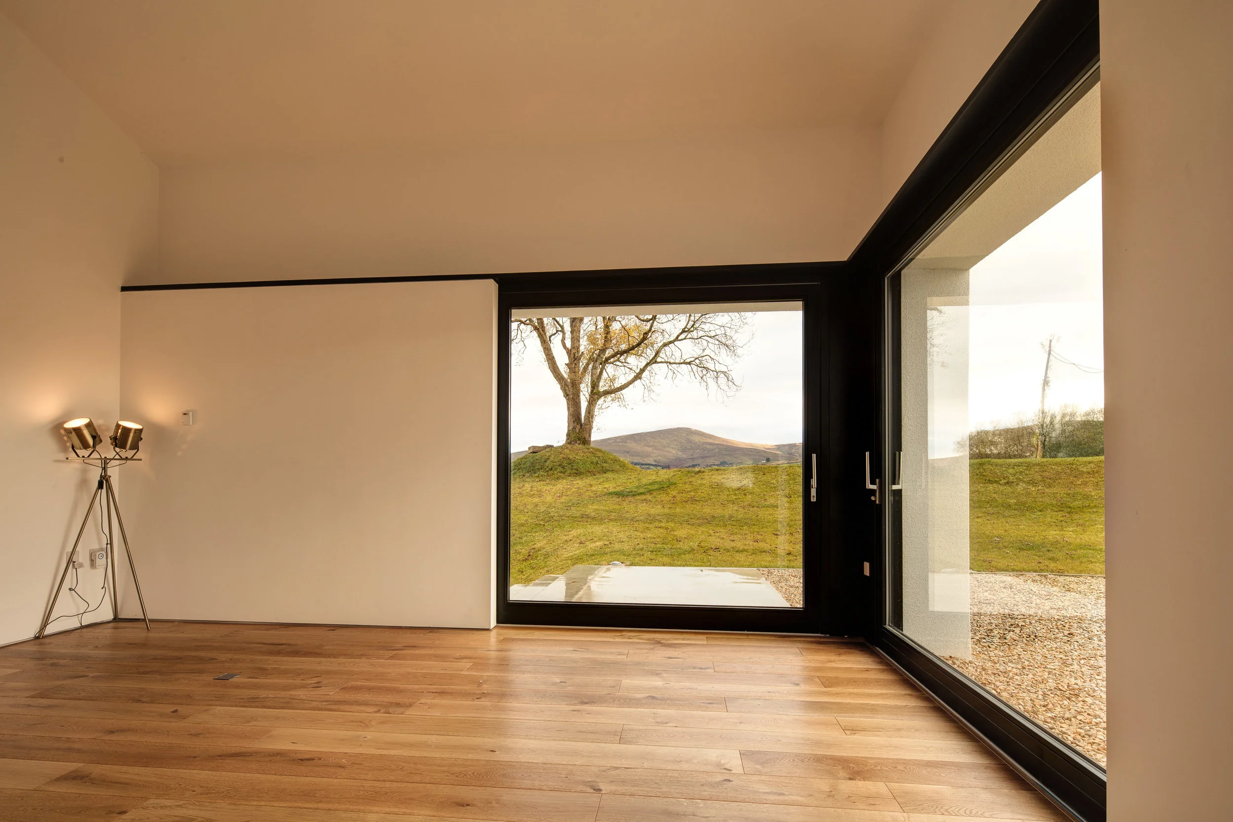
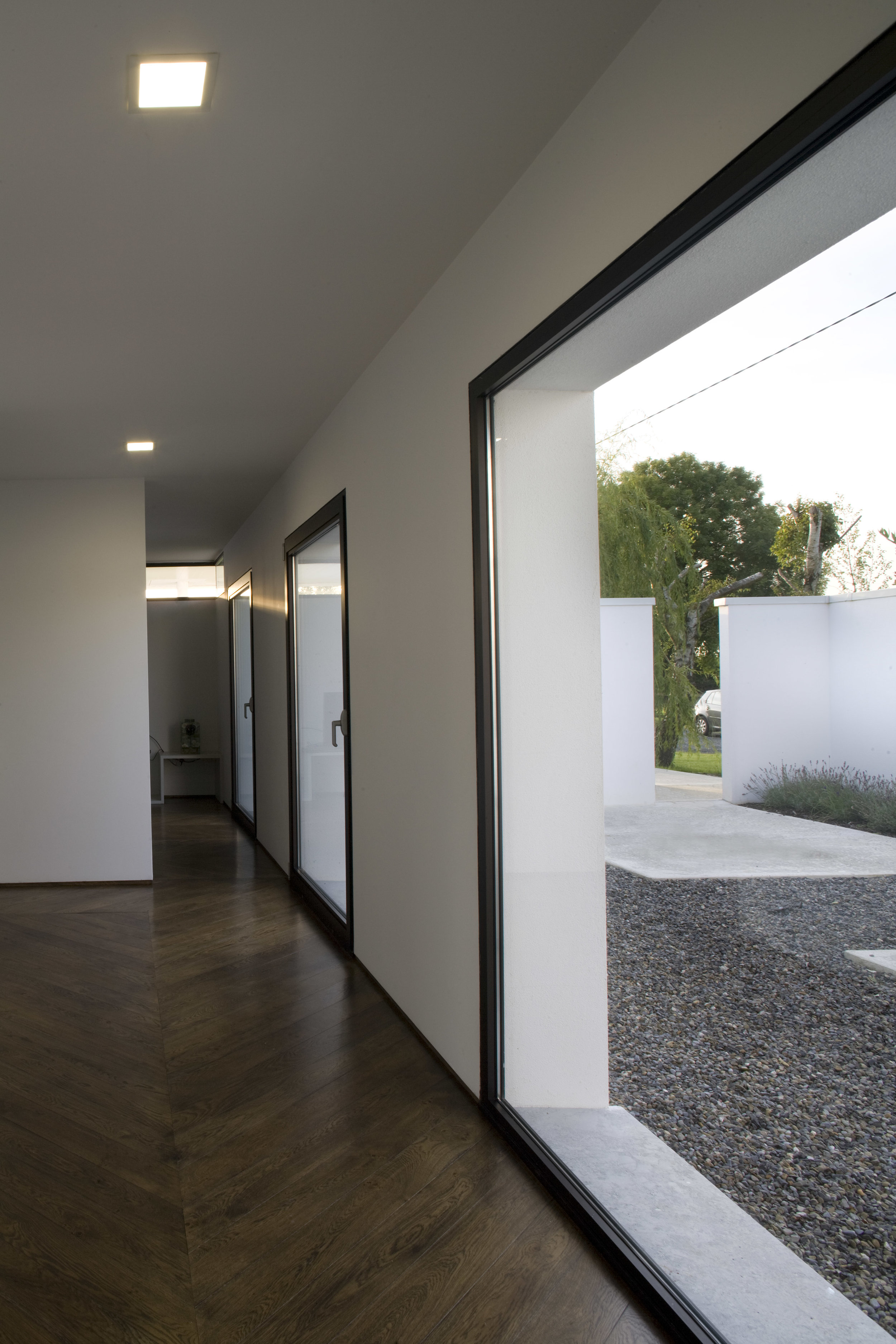
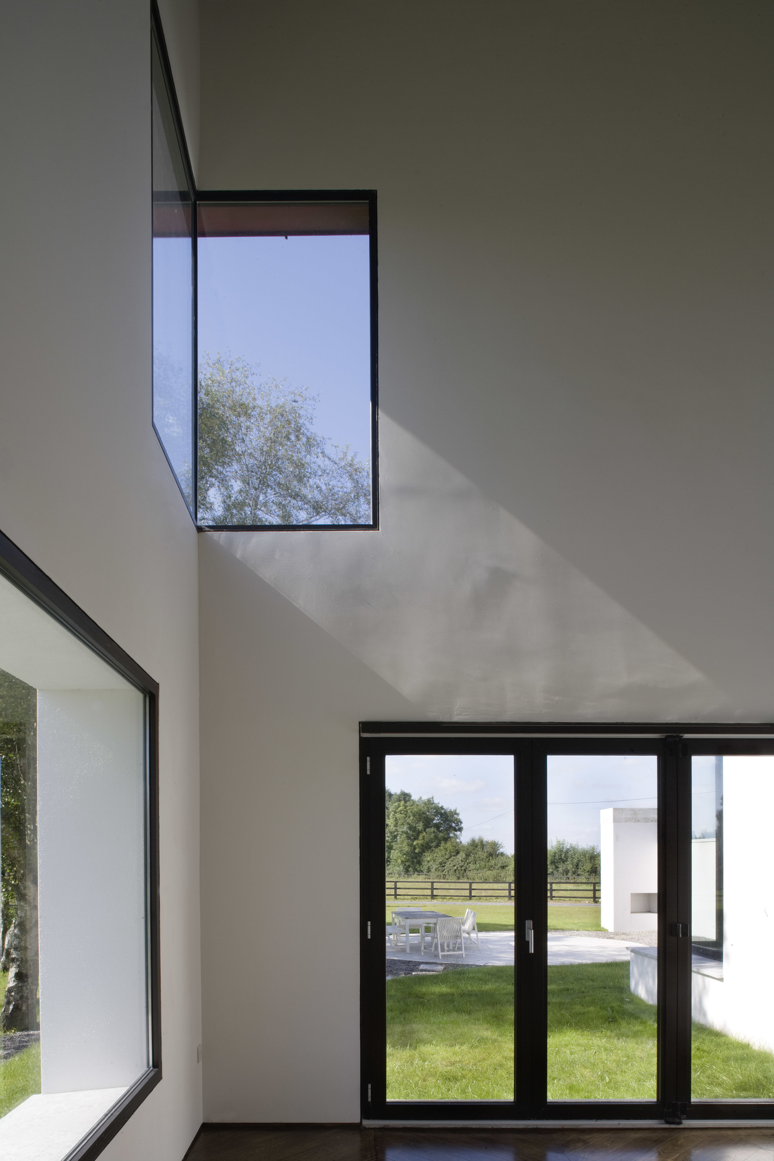
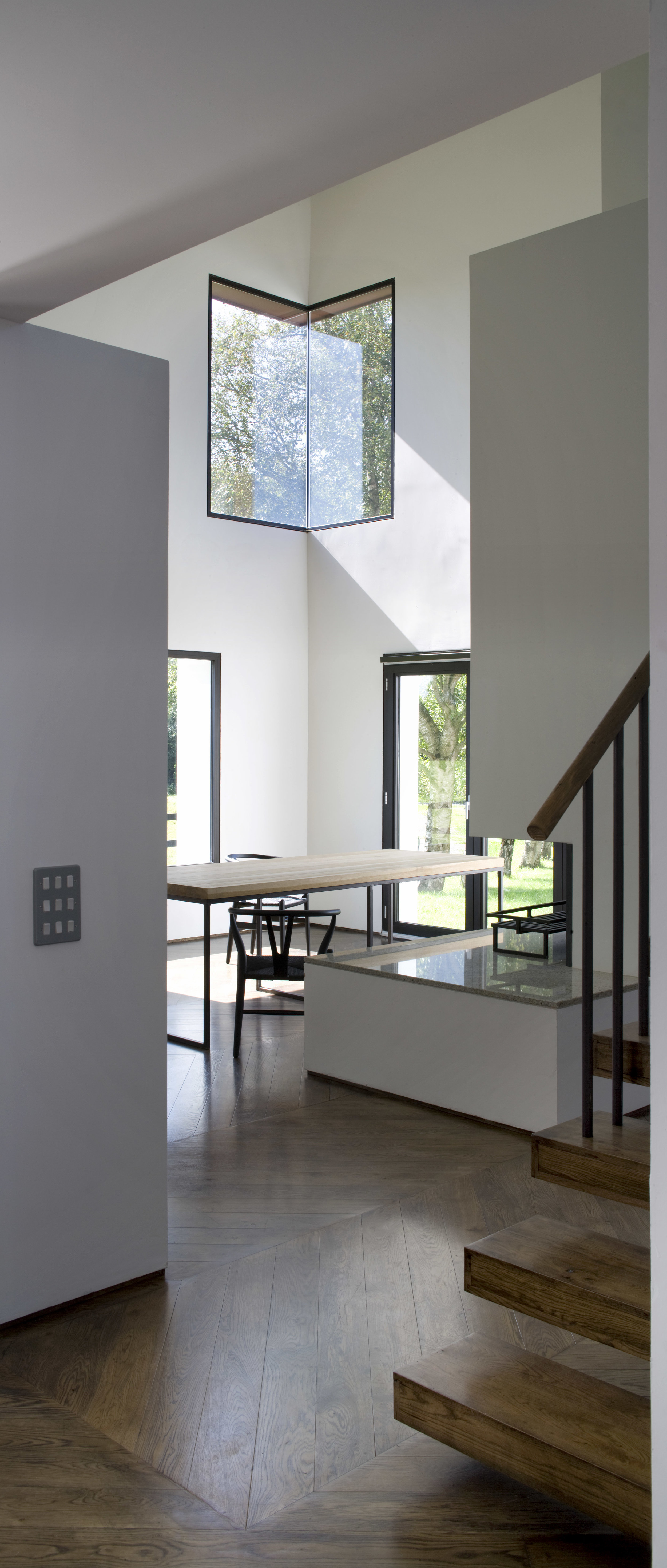
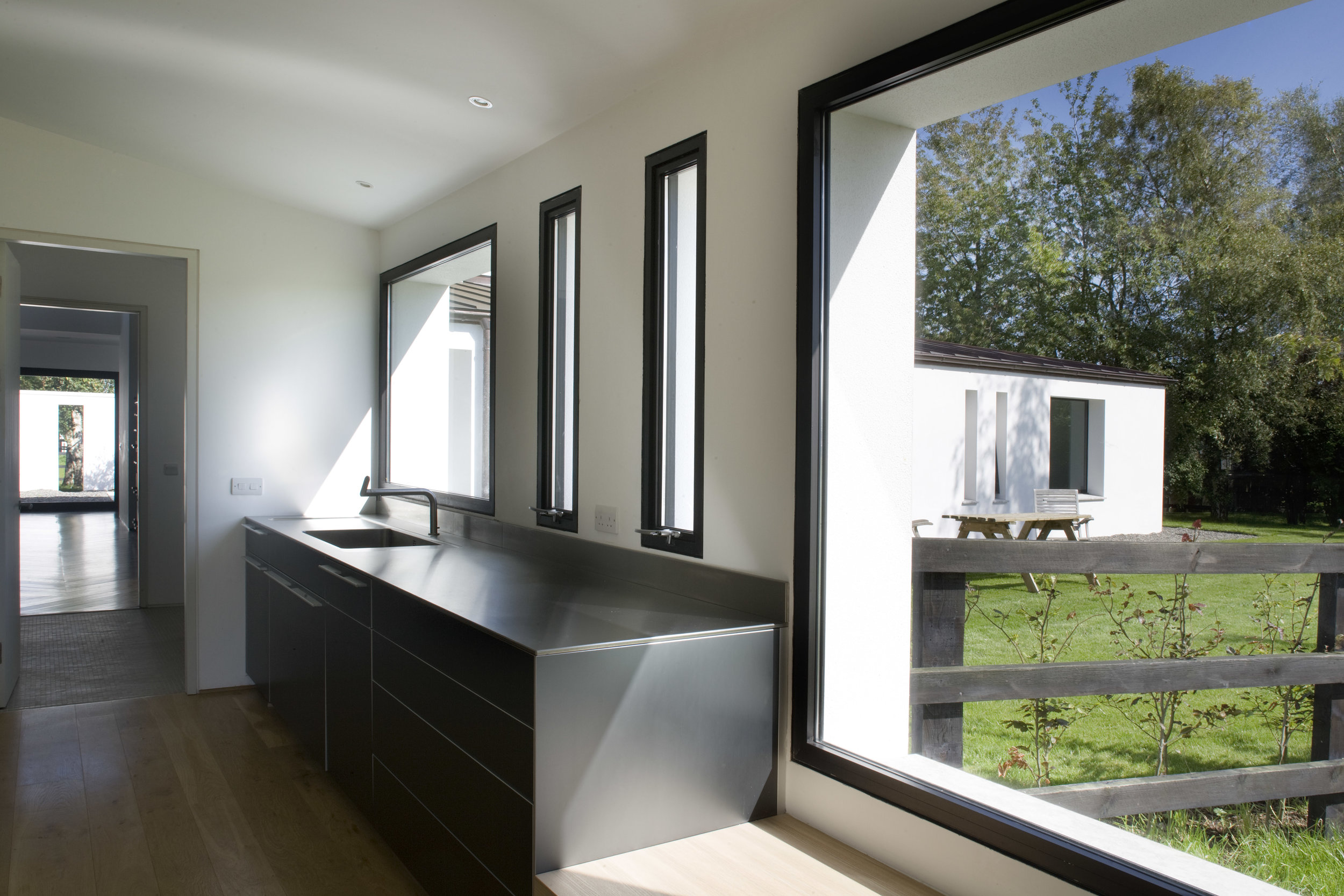
The Western area of the building accommodates living and dining areas under a barn-like semi barrel vault which attempts to maximise views and solar gain to the South and West through large windows, clerestory glazing to terraces extending into the landscape. The kitchen is located centrally and prominently to address East, South & West aspects and establish its position as heart of the home. The bedrooms are located in a more secluded North-Eastern wing with views to the East and South and access to a landscaped walled courtyard which also provides service access to the house. This walled garden, like the extending gable walls and entrance canopy, tries to bring the building into its landscape and vice versa.
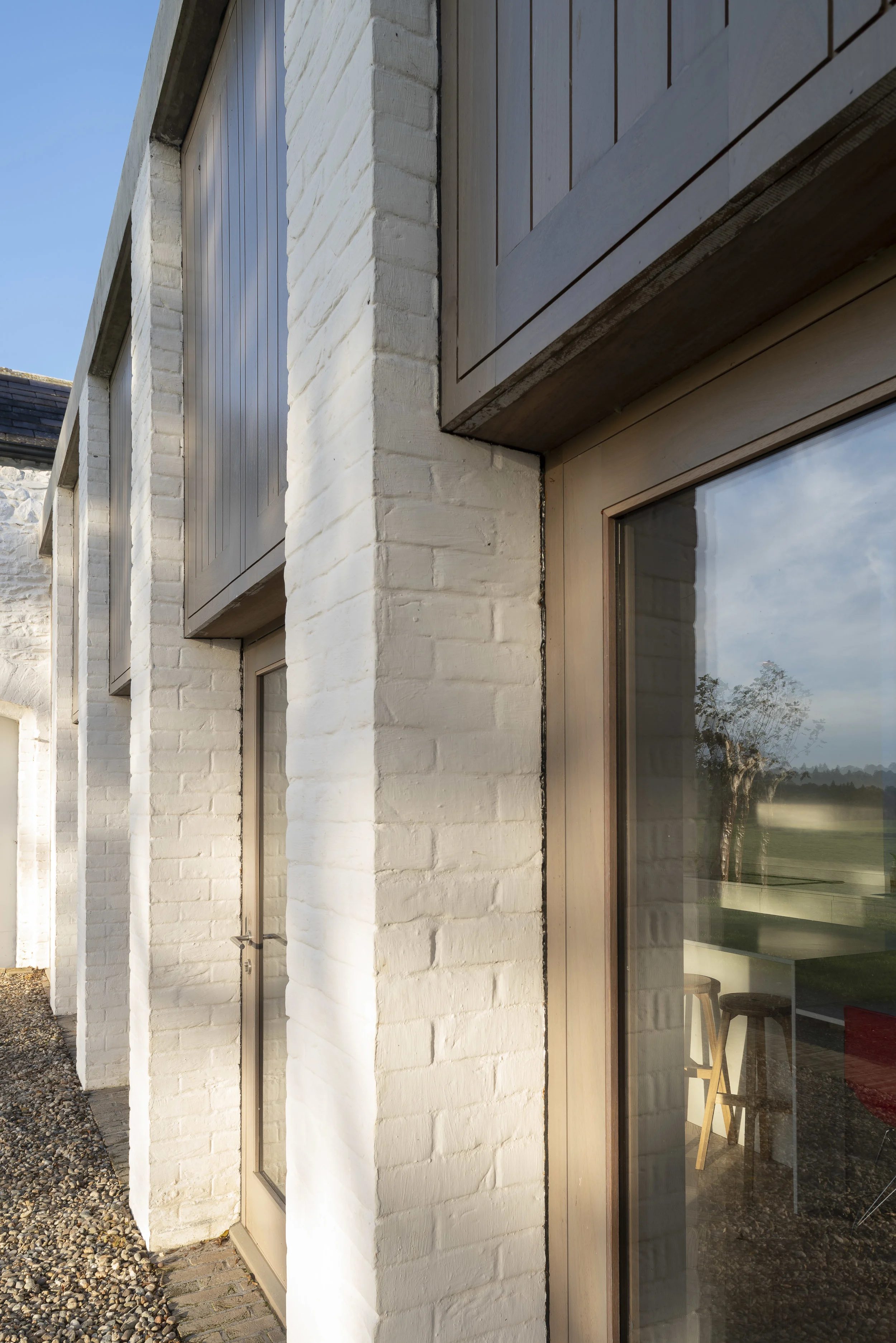
The form of the building is twofold - one side, the living areas, reaching up high in the style of a barrel vaulted barn abutted to a lower mono-pitch roof as displayed in agricultural structures throughout the country. Such buildings often had corrugated metal cladding which inspired the choice of the copper roofing material. The bedroom wing, with internal courtyard, is lower in height with a low pitched roof and regular rhythm of openings derived from the feeding and ventilation openings of traditional stable buildings. The window types throughout the building are either fixed picture planes or narrow ventilation openings. The two principal forms of the house are linked but defined by a lower flat roof area which delineates the circulation and cantilevers externally to form the entrance canopy.
Thick, white-rendered walls and extended enclosure walls which tie disparate elements of the house together are analogous to typical traditional farmyards where lime-washed stone and rendered walls encapsulate an archipelago of outhouses. Throughout the building windows and doors are set to the inside wall face to accentuate the depth of the exterior punched openings.
The design attempts to provide a dwelling in character with its surroundings by utilising its environment and applying a relatively traditional agricultural building language in a modern architectural style.
This 19th Century farmhouse was built to replicate the owner’s previous parsonage in Sunderland but decline of the farm meant auxiliary buildings were neglected and in disrepair. The Brief was to improve daylight levels and provide a kitchen/dining area that would avail of surrounding views whilst outbuildings were to be structurally stabilised and potentially used.
To emphasise the strong forms and elegant proportions of the existing buildings the mono-pitched structure to the rear of the dwelling was removed and a simple link building proposed between dwelling and coach house. Subsequently the coach house becomes part of the dwelling elevation within a series of 3 roof profiles; hipped, gable and flat where the new extension is tertiary in the hierarchy. With reference to the historic 3 bay front façade of the house a tripartite composition is repeated in the East facing extension with two lower wing enclosures for entrance and utility framing the third primary kitchen element behind. The extension retreats from existing building lines to form entrance enclosure and a West facing private courtyard with colonnaded facade to express a delicate connection between buildings whilst opening to the views.
Referencing the adjacent historic byre structure of central brick columns the new extension structure exposes sets of planed larch purlins face fix to new brick columns and support larch rafters under a birch plywood ceiling. Textures of exposed structure and limewashed brick attempt to compliment the adjacent historic materials.
Within the main dwelling vestibule walls restricting daylight are removed and staircase rotated providing a large bright entrance hall. The master bedroom extends with an ensuite overlooking the coach house through a new tripartite window and further extends into the attic. Restored outbuildings provide service areas and the coach house structurally stabilised and weathered however its internal refurbishment is a future phase.
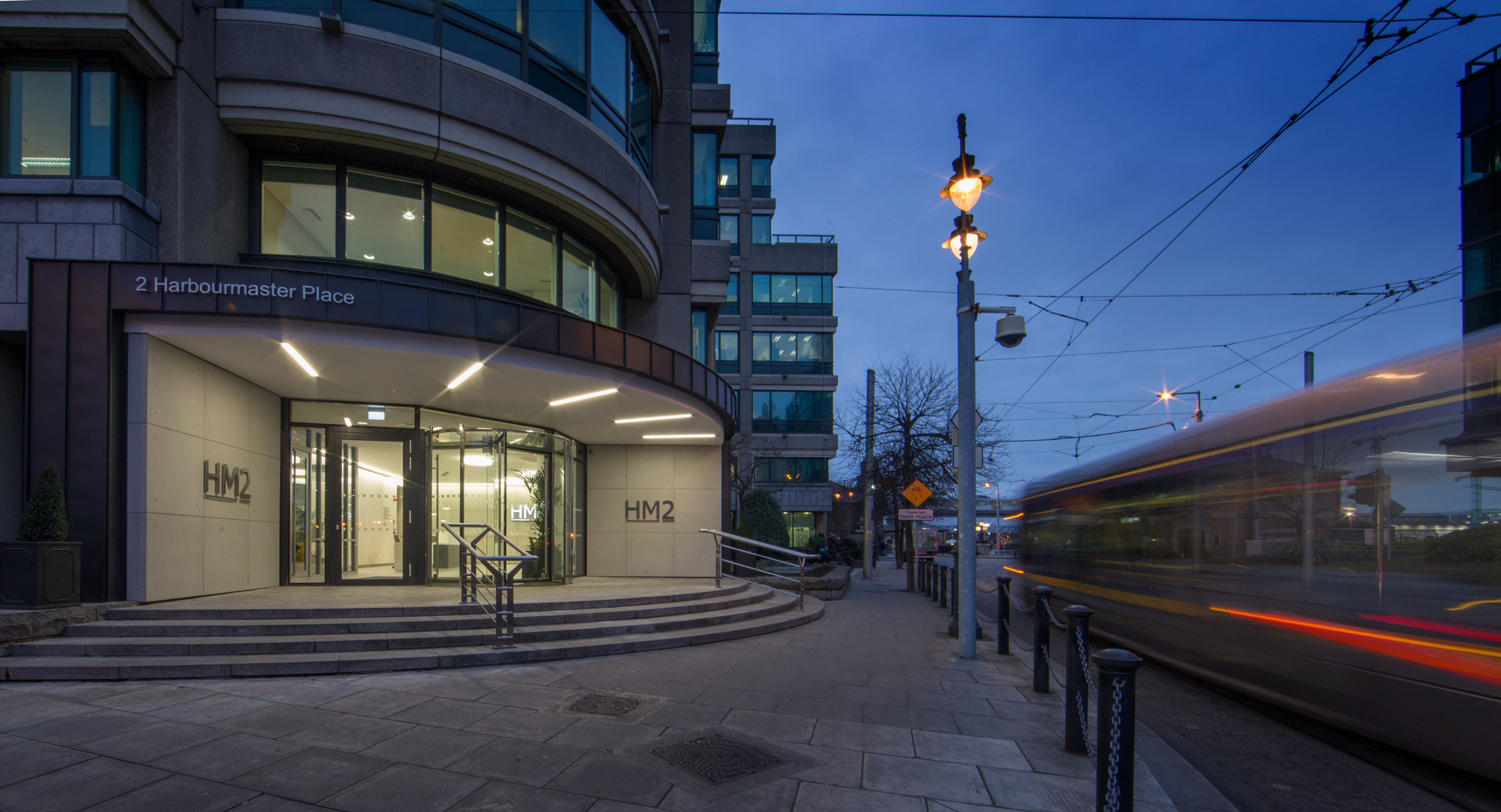
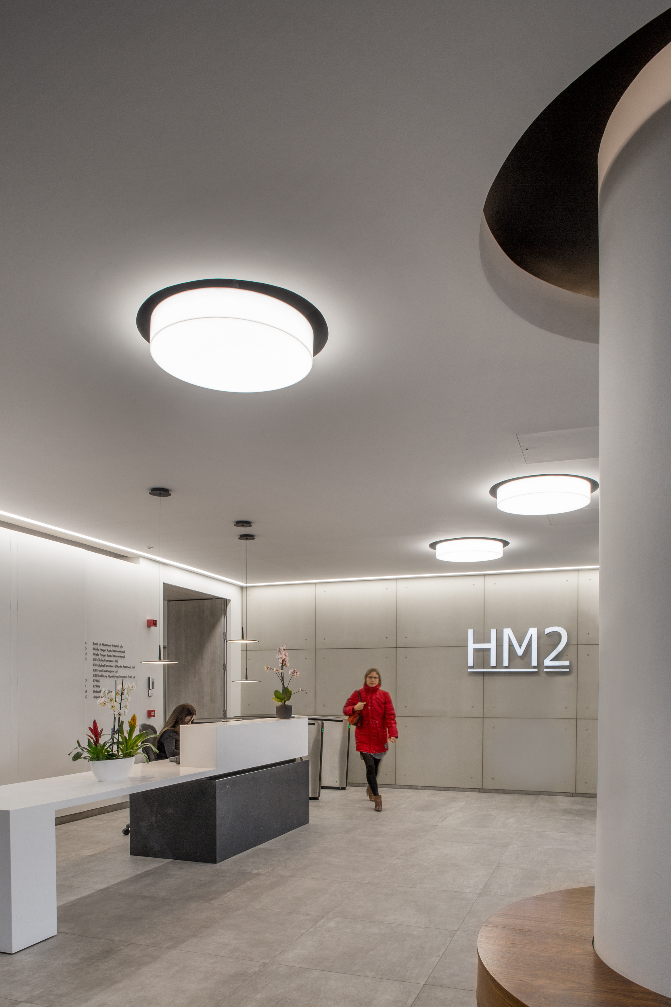
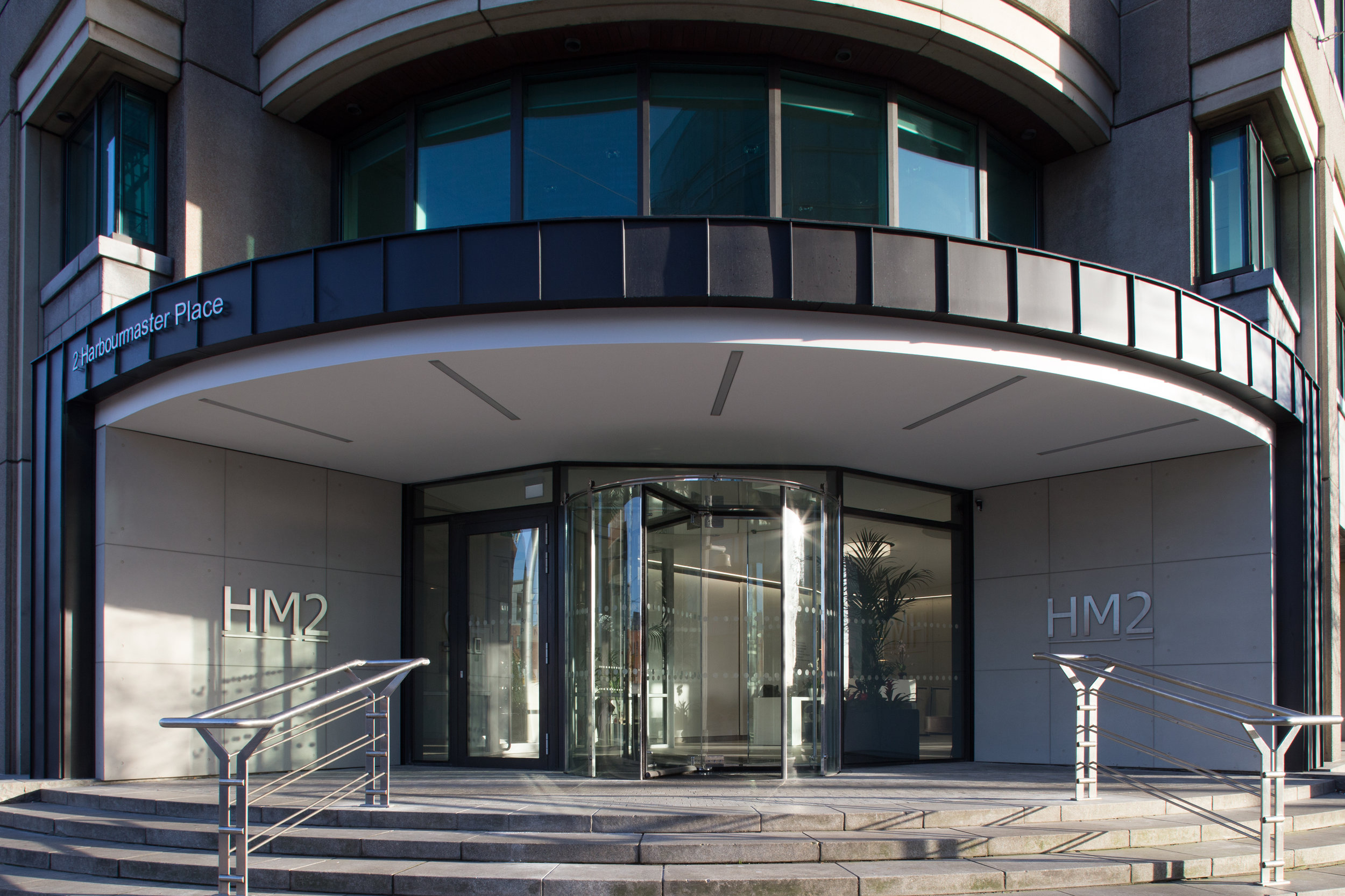
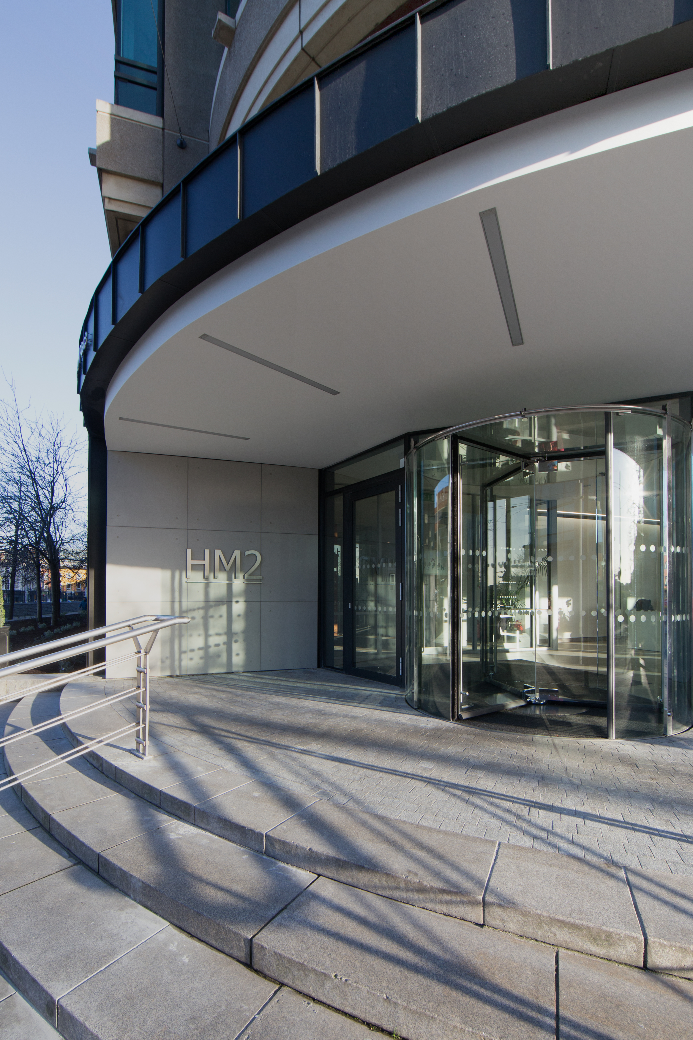
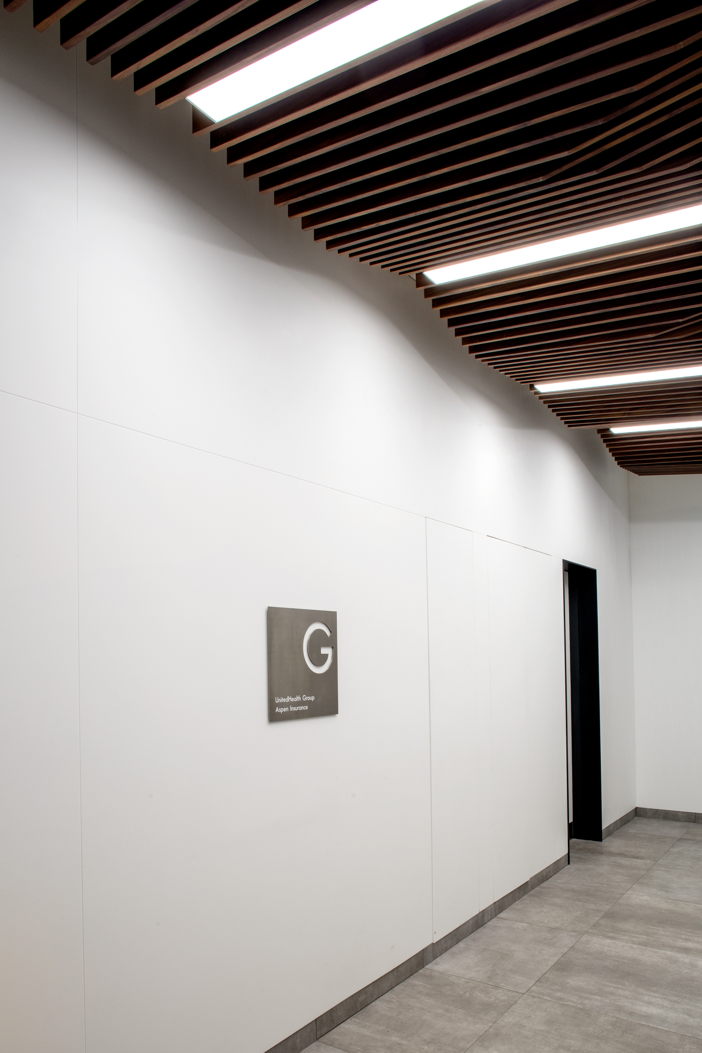
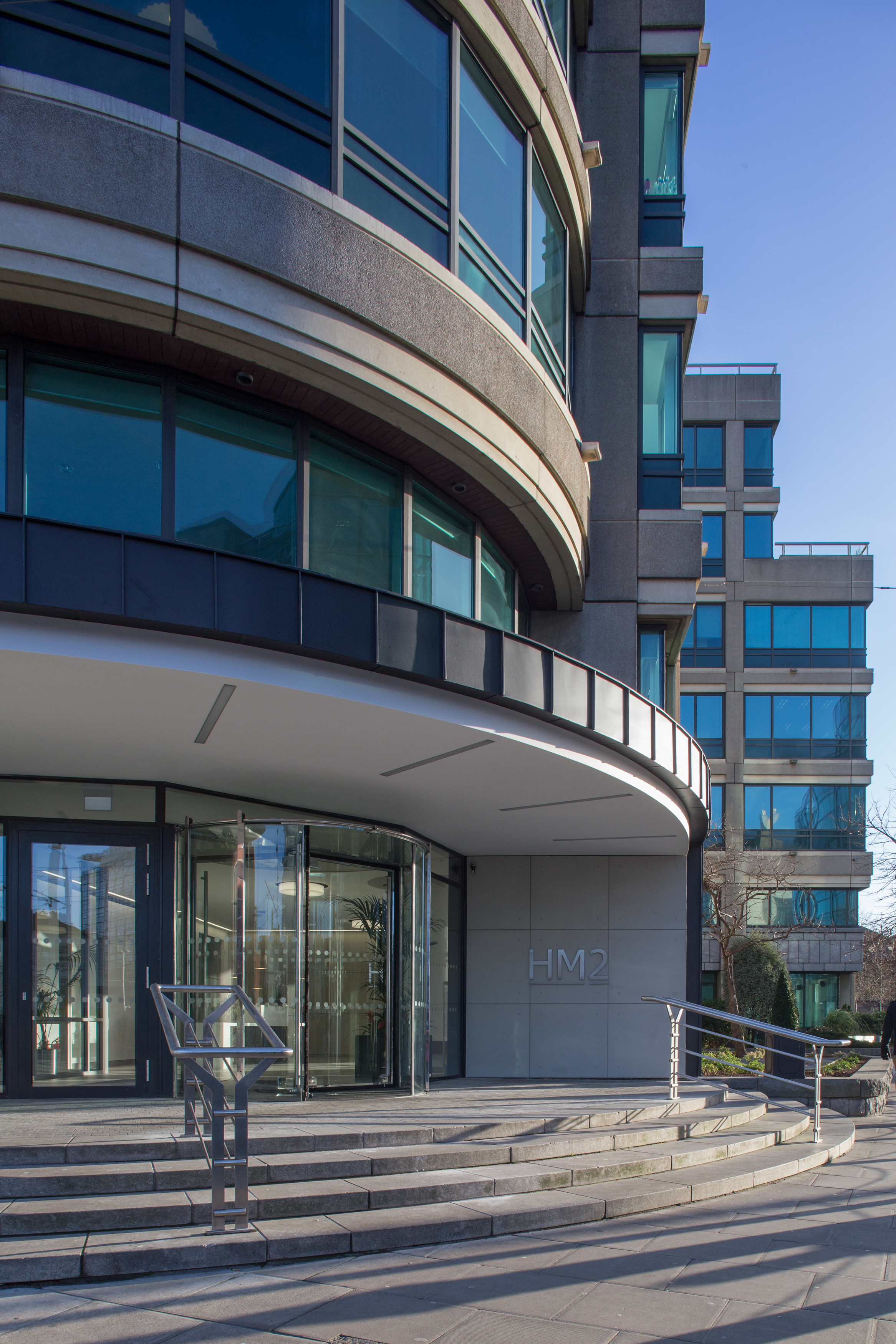
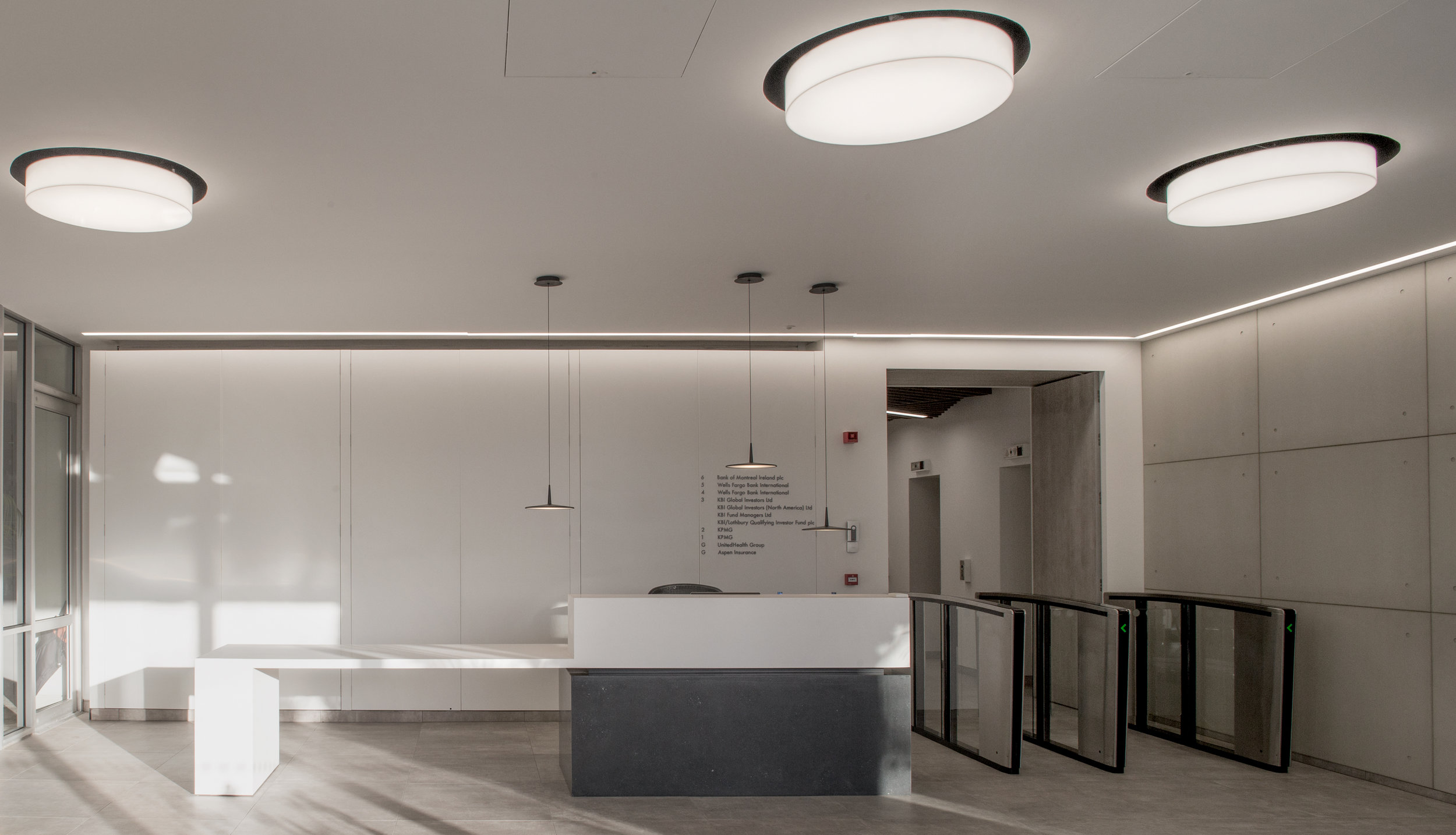
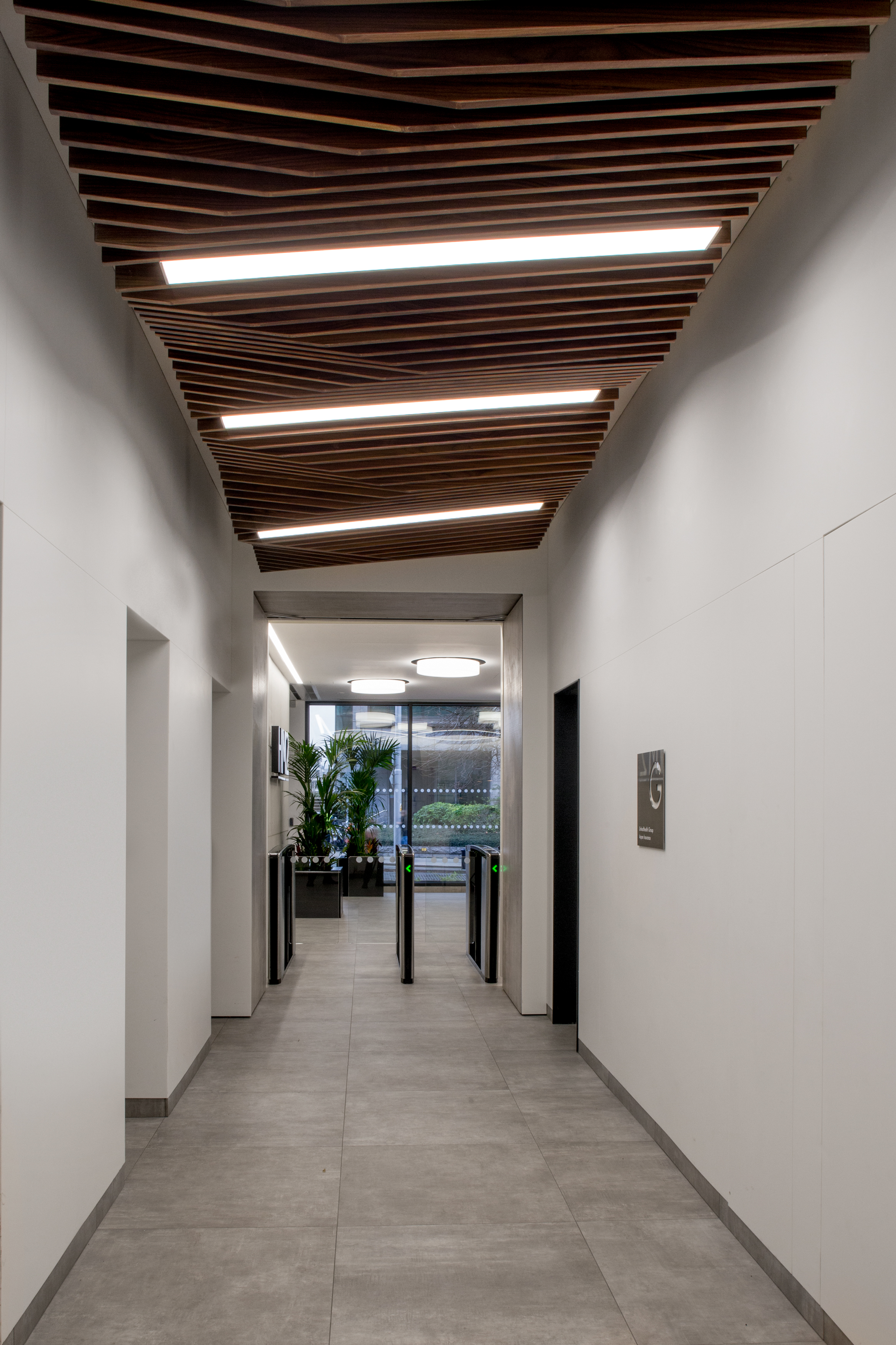
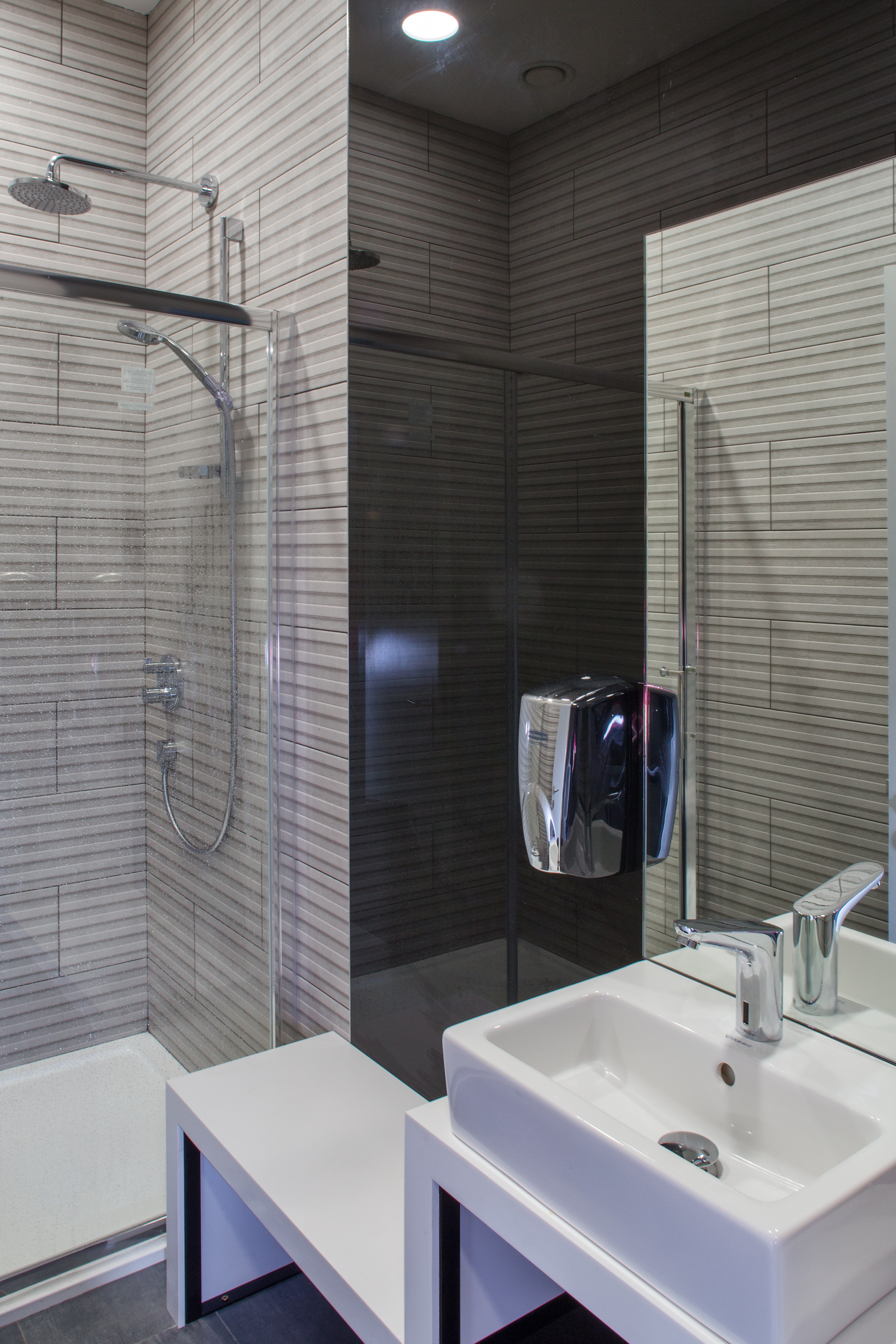
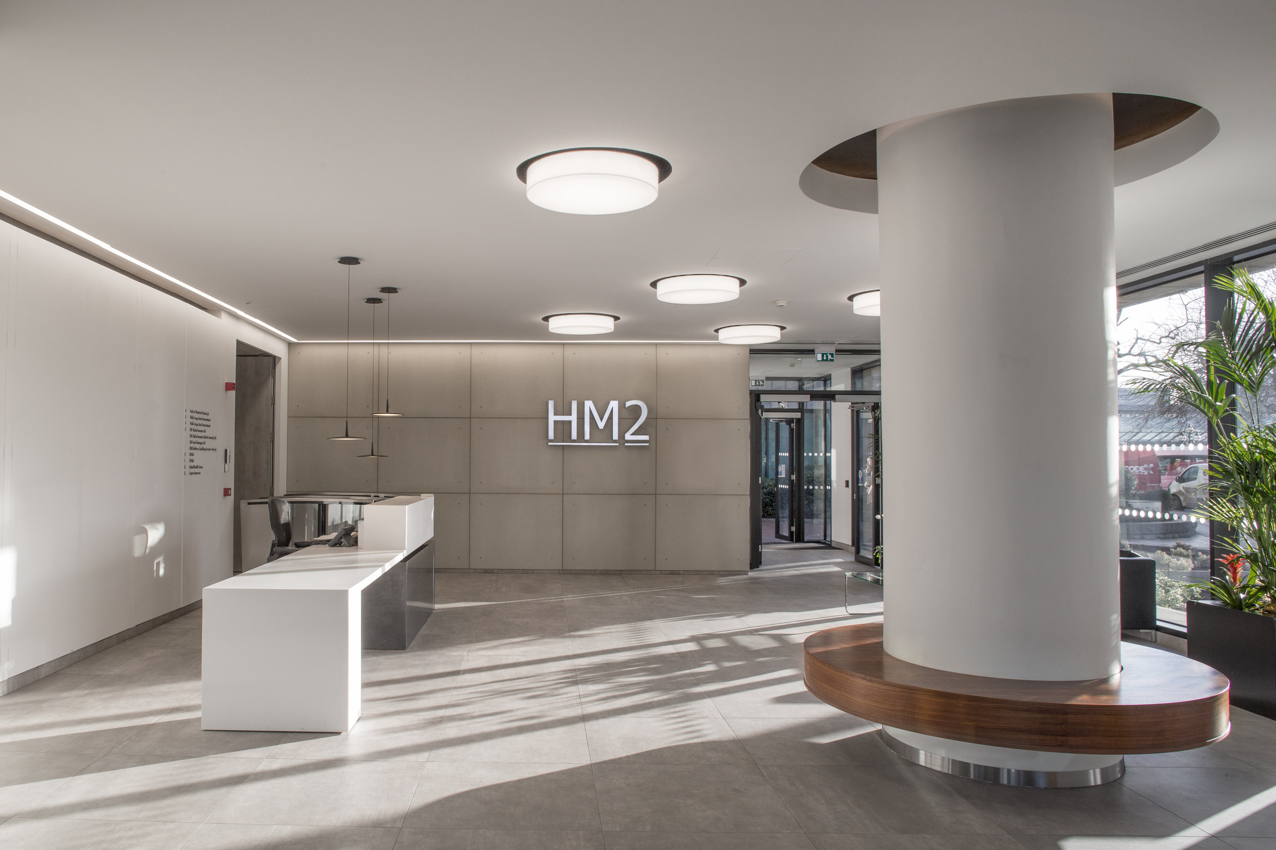
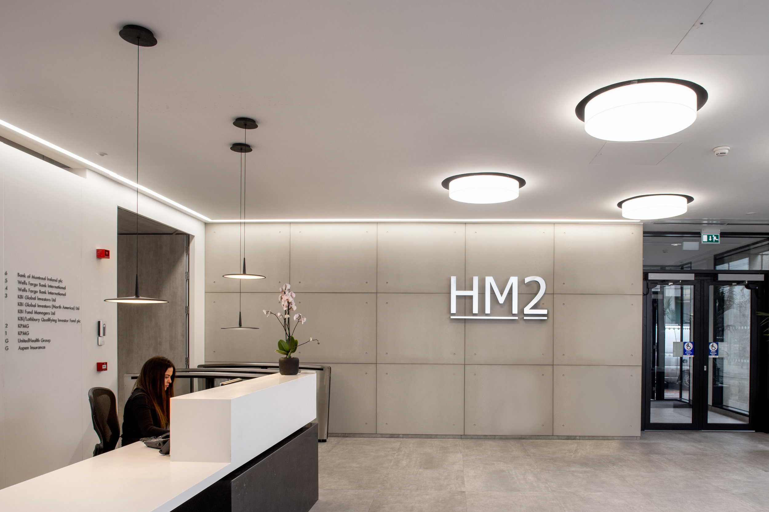
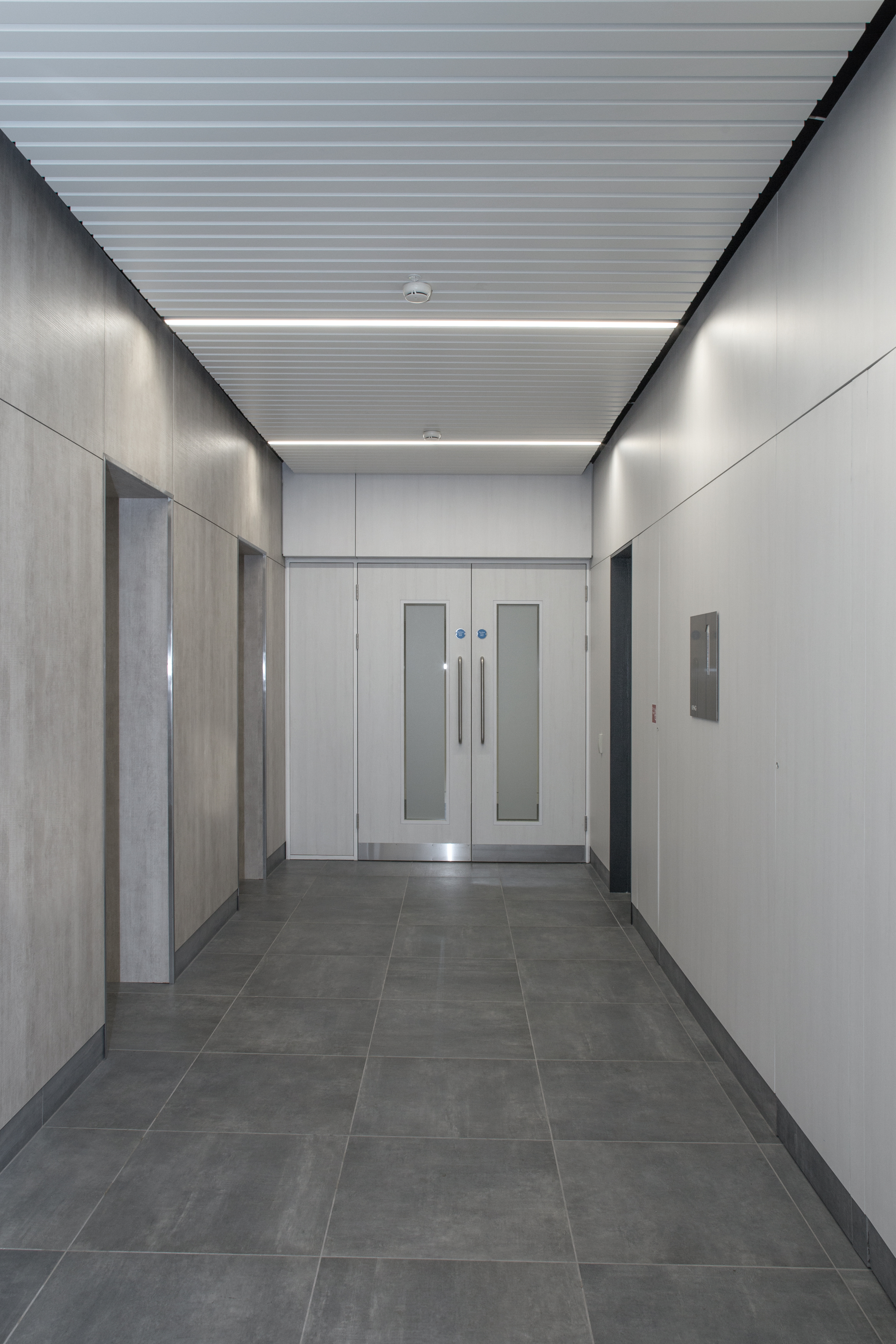
The existing 1990’s office building at the entrance to the IFSC district had a series of dated internal public spaces and an underwhelming main entrance. The building was given a new branded identity as HM2 and a collection of spaces and finishes to meet tenant expectations of a Grade A office environment. The reception area was transformed with new floor to ceiling structural glazing maximising the light in the new space. Opening up the reception to the street affords views out but also into the new reception space for passing pedestrians. A new illuminated canopy feature redefines the buildings main entrance at the junction of Harbourmaster Place and George’s Dock at the gateway to the IFSC. The reception area was also reconfigured to open up a secondary entrance to facilitate the pedestrian flows from the east. New shared shower and changing facilities were also provided. Internally the new reception space has a pared back minimal aesthetic including a bespoke reception desk constructed of acrylic and Kilkenny Limestone. Loose fit furniture is eschewed in favour of a built in circular sea that mirrored the recess in the ceiling above. The ground floor lift lobby is clad in acrylic with a bespoke floating ceiling feature of undulating walnut fins. The upper level lift lobbies have been completely overhauled with Finsa timber wall panelling and doors, aluminium ceiling planks together with recessed linear light fittings. A new porcelain tile floor finish completed the new streamlined aesthetic.
The concept for the project was to transform the image of the building both for the tenants and also the wider public. This was achieved by replacing a heavy and dated interior with light filled spaces where crisp detailing and clean lines throughout. The internal refurbishment works together with the new entrance and facade elements have reimagined the building for the tenants and passing public alike.
The site strategy is based on the local terrace typology but addresses the need for safe vehicular access off the Lucan Road. The building line is set back sufficiently to provide a shared landscaped forecourt.
The design strategy creates a new terrace of housing in Chapelizod given it is the prevalent existing typology in the area. Detail embellishments on the historic terraces also provide design references for the proposed facades.
House designs retain the predominant 2 storey scale of the village along the street and step down to the river side where a third storey takes advantage of the sylvan setting.
Floor plans are dual aspect to allow south light into the principle living spaces. The ground floor entry level kitchen/dining areas occupy the full depth so that views and light can be exploited.
Private garden areas are provided to the rear along with balconies and roof gardens accessed by stairwells designed with reference to the local historic chimney stacks.
One of the primary characteristic of these mid 20th century houses is the large rear façade chimney. Given the height and presence of this chimney stack and it’s balance with the neighbouring equivalent it was decided to use this as a focal point in the roof design off which all extending roof pitches generate.
In order to utilise the good Western aspect along the boundary of the sizeable rear garden an extension stretches into the garden to maintain light, ventilation and views to and from the original rear façade via a courtyard. Conscious of the neighbour’s daylight aspect and long extending building the roof shape is formed with low pitches which spring from the existing main chimney stack. The low rising angles are further brought into the extension walls to direct light in a similar fashion to how the roof rises to capture clerestorey light.
The single storey extension wraps around a new courtyard allowing South and West light into the centre of the plan whilst catching glimpses of the long landscaped garden. An external fireplace and stone gully for rainwater spout add aspect to the courtyard which is accessed from the kitchen & dining areas. A living room terminates the extension and opens into the garden availing of evening light with South facing clerestory windows above the boundary wall. The bevelled canopy and edge wall also enclose and hide utility access to the garden.
The kitchen is central and acts as a hub from which all areas may be accessed. A full refurbishment of the main house provides a new staircase with change of direction to allow daylight into the hall and provide access to the attic. Materials chosen were to compliment the original industrial syle steel windows such as post finished concrete and limewashed birch plywood.
This renovation project provides generous living spaces with abundant natural light in a mid-terraced, red-brick Victorian house in north Dublin. It combines distinct, contemporary elements with historic features to provide modern comfort and style while celebrating the decorative feature of the existing house.
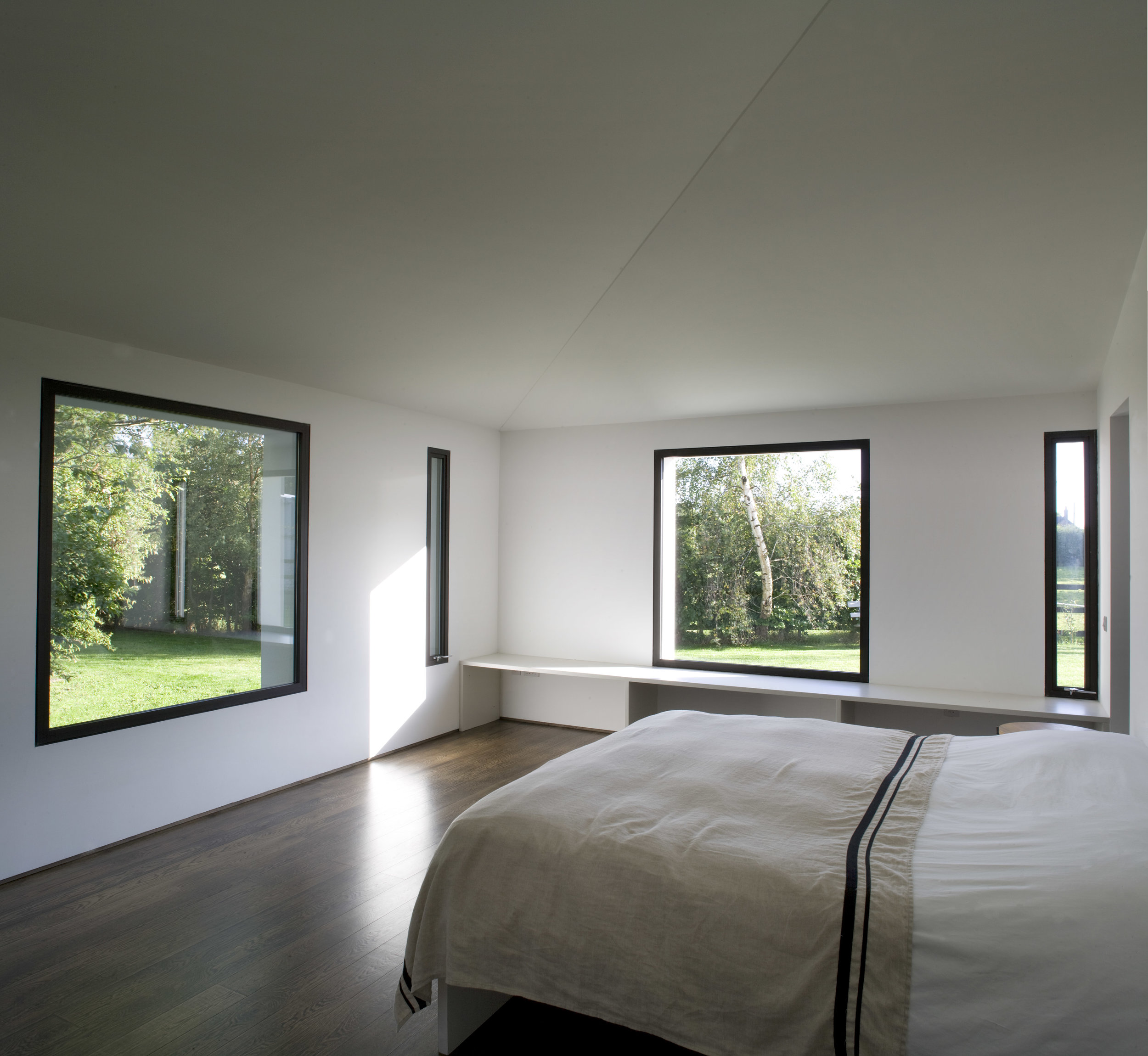
Bedroom areas and a dressing room are situated at ground level, with a guest bedroom in the rear return. New bi-fold windows are fitted at seat level in the guest bedroom to open out onto the rear garden. The floor joists are exposed above to give additional height to this room.
The new kitchen and living space are located upstairs to avail of striking east-west natural light. This is accentuated in the kitchen with reflective fittings and brightly-painted walls, while the light is muted in the living area with darker finishes and absorbent fittings.
A generous bathroom at the half landing of the rear return is concealed behind a newly-fitted bookcase with an integrated jib door. Parts of the floor are removed in this room to allow light from its windows flow into the ground floor areas below.
The governing approach to conserving this protected structure was to restore and retain all original building fabric and ensure any alterations did not obscure the legibility or character of the house.
The sociable areas of kitchen & dining were moved to a newly opened first floor with East & West light and views through Grantham street and allowed the private bedroom areas be removed from the main front door.
The historic plan was largely retained whereby only one minor partition was created in the lower ground floor to create a bathroom within the undercarriage of the front steps. Courtyards were formed to the front and back to maintain the legibility of the historic building and allow light and cross ventilation through the plan.
An intrinsic characteristic of this house type, the return corner fireplace, was nearly destroyed in previous alterations. To address this, the corner fireplace was used as generator to the extension’s form by springing a new angle of circulation which allowed the garden living room be entered on the corner subsequently providing ample width to the room and South facing garden path. Angled partitions to the back of the WC accentuate the original fireplace and provide for a desk space beside the courtyard.
The lower floor level was maintained from front to back of the house allowing for a bay window seat at garden height with direct access to a small garden terrace. The extension deliberately takes on the new orientation to promote a different South West looking aspect as distinct from the upper floor and original East-West aspects. This idea is expressed in the external brickwork of the new corner fireplace - laid in the original orientation but aligned along the new angle. Material choices of black polished concrete and staggered burnt stock bricks were influenced by the fragmentation, layers and colours of the historic garden walls.
The previous condition to the rear of this end of terrace Protected Structure ignored the potential of the large South facing garden by containing only small openings with associated service rooms whilst the kitchen, the heart of the home, faced a busy road to the North. The cellular layout of the basement exacerbated the lack of light penetration and further emphasised the damp and cold environment. Subsequently the primary aim of this ground floor extension was to capture the potential of the building’s orientation by opening up the South façade and re-locating the family living areas here. This principal was extended to affording views and light from the South deep into the plan to the extent of a vista from the upper ground floor front door.
Although the intention of the design was to maximise solar gain and views the form of the new building aimed to take influence from the existing terrace as opposed to allowing only the light to dictate the proposal. The area available to extend was awkward as it is quite long and narrow and a two storey extension would be liable to detract from the upper ground floor reception rooms and take their point of light penetration further away. Therefore the massing of the extension was important.
The forms chosen take their influence from the various opposing pitches of the roofs and their returns on this terrace. The extension attempts to use the angles of these roofs to symbolically step down to the garden – the roofs gesture down towards the garden in a cascade of pitches. This concept led to the proposal of two forms within the extension to break the massing up due to the long plan and to promote the effect of the building breaking down to the rear terrace. The tall narrow volume reaches high to bring East & West light deep into the plan whereby the first floor of the new balcony and in line with its balustrade. Another purpose for this step is to drain to a valley gutter below the cill of an existing first floor window in the return which has been maintained as a clearstorey window to the kitchen and gallery. The lower extension protrudes beyond the tall volume to accentuate its linear nature and to wrap around and form the downpipe recess for the valley gutter. The corner window here is to allow the screen to the casual dining to fully open back.
The original dwelling was constructed in 1986 against a backdrop of rich landscape surrounding the adjacent golf club’s fairways providing considerable aspect to the rear garden. Proposed additions were subsequently minimal to retain ample space from which to avail of this scenery. Therefore a 10sq m utility return, obstructing Southern sunlight, was replaced with a 25sq m addition that extended internally 35sq m with alterations and finishes depicting the structural set-out. A further 115sq m was refurbished and Practical Completion reached in May, 2013.
The Clients’ desire to maximise solar gain with a more sociable living area influenced the design intent, commenced August 2011, whereby the extension’s greater height, lower floor level and stepped plan allowed deep light penetration. Tall windows and screens are placed to view the lush foliage whilst a mature Scots Pine on axis with the central hall is framed in a vista through the house. This axis focuses activities via a central internal hub, the kitchen island, off which hall, dining, reading and kitchen activities congregate. Similarly an external central hub on this axis, the brick planter, directs the activities on two terraces, garden and shed around it.
The extension’s façade comprises two forms alluding to the step in plan and express the dining/reading and kitchen/utility areas behind. The reversal and separation of these major/minor shapes, book-ended around a large central window, provides focus on the axial hub design. White brick compliments the existing rear render and front red brick facades. Expressed, polished concrete lintels indicate the major external access points whilst the upper lintels denote the clerestory windows they shelter.
The enduring impression of the 18th century Windmill ruin outside Derrinturn village is one of an elegant, flawed but impressive stone tower where its elevated aspect emphasises its vertical proportions. The proposal is for a continued use to help conserve and maintain the building and to clarify and preserve the ruin by furnishing it with a contrasting but complimentary natural material which distinguishes the contemporary whilst promoting the stone ruin as the primary feature.
In proposing a continuing use thought was given to the defining characteristics of the existing singular tall space with minimal openings, an introverted dark space. In attempting to strengthen the windmillʼs connection with the village, physically and socially, the potential of its primary characteristics as a tall dark space is utilised in the proposal of a taller dark space, camera obscura. The Latin name describes two of its three main components: camera, room; obscura, dark. The third requirement for a functioning camera obscura is to let light into the dark room through a small aperture. Light projecting inside the dark room will display an inverted view image of the external space on a concave surface facing the pinhole.
With reference to the Windmillʼs original purpose of providing sustenance and connecting folk to work and place, the camera obscura proposes to re-establish this connection by promoting the understanding of the physical relationships created by interaction of place, work and people through close observation. The observer, from a dislocated position, experiences and witnesses the local living landscape and its relationship within the wider environment and informs their outlook through an “Outlook Tower” as championed by the Scottish biologist and socialist, Patrick Geddes. Native larch is proposed to clad the housing for the camera lens which sits within the enclosure of the stone structure.
Existing stone indents are use to spring the structural larch
beams which are off centred and stacked to spiral upwards, inspired by windmill sails, to gain the height required and create the central opening for the light projection.
The Olympia Theatre began as Dan Lowery’s Star of Erin Music Hall with an entrance from Crampton Court in 1879. In 1897 it was refurbished and the Dame Street entrance was added. By 1917, this became the principal entrance with the erection of the wrought iron canopy on Dame Street.
As a result of the ad-hoc development of the theatre, the existing facades to Crampton Court, Dame Street and Sycamore Street bear little connection to one another and appear disparate. The proposal is to upgrade the existing facades of the Olympia Theatre and strengthen its identity within its context. Non-historic elements would be removed, and an architectural language would be developed in colour, facade treatment or building elements to provide a cohesive aesthetic.